Category Archives: Uncategorized

PAINT, PRINT & DESIGN

Standard

For the last five days I have been working with fabric paint and an open mind to develop a new class called ‘PAINT, PRINT and DESIGN’. This workshop samples many techniques using fabric paints. I found that if you keep the paint on the thinner side, it alters the fabric very little. Although I prefer working with thickened Procion dyes, I wanted the process to be very immediate for the participants. Most of the techniques could be appropriated to thickened dyes at a later time.

This class is useful for:

*those who want to incorporate more personal imagery into their quilts

*individuals who feel stuck and need some inspiration

*making original work for digital design

*mixed media artists

*those who love abstract design

*Art Quilters in general

*all ages and abilities

FOR MORE INFORMATION PLEASE CHECK OUT ‘CLASSES- ‘Paint, print & design’ IN THE ABOVE MENU

Here is a taster:

SD-wet-in-wet-cardboard-edges-wb SD-brush-petals-wb SD-salt-flakes SD-white-paint-resist-wb SDStamp-over-wet-background-wb SD-two-colour-sample3wb SD-stamp-with-white-pain-resist-wb SD-sunprint-with-plastic-tablecloth-dyno-wb SD-Hot-glue-stamp-and-wash-away-wb SD-Foam-brush-experiments-3wb SD-Foam-brush-experiments-wbSD-elmer's-glue-resist-plus-red-paint-wb SD-thermofax-print-wb

SD-washaway-sponge-letter-print-wb SD-shaving-foam-marbling-wb Ubiquitous-bubble-wrap-wb Sharpie-stacked-journalling-wb SD-foam-print-over-wash-out-splattered-background-wb SD-shiva-rubbing-wb


Risely Family Portrait

Standard
Risely-Family-portrait-web

Risely Family Portrait 2014 1m x 1m

A recent commission for a lovely family from Picola. Oi is originally from Thailand and is the most wonderful cook ever; she can make a delicious meal out of thin air! Sean has helped us out with our poor neglected garden- he especially loves roses, hence the inclusion of Iceburg roses. Jai-dee is a clever little lass who attends Nathalia primary School where my husband works as a Chaplain.

Technique: Handpainted/silk screened wholecloth background. Fused fabric applique for figures and roses. Confetti technique for the tree leaves. I used Inktense pencils to shade the roses and the leaves were printed with compressed sponged, cut out and appliqued.

Oi-web

Oi detail 2004 Linden Lancaster

Shaun-web

Sean, crop 2014 Linden Lancaster

Jai-dee-web

Jai-dee, crop 2014, Linden Lancaster


I took photos of the roses, cropped them and played with them in Photoshop. I used them in sets of (window)  cards for Christmas presents.

card2.jpg-web

Linden Lancaster 2014

card4.jpg-web

Linden Lancaster 2014

card5.jpg-web

Linden Lancaster 2014


card8.jpg-web

Linden Lancaster 2014

card7.jpg-web

Linden Lancaster 2014

card11.web

Linden Lancaster 2014

card9.jpg-web

Linden Lancaster 2014


Last latitude Quilt- ‘Look to the Hills’

Standard
Look-to-the-Hills-2014-web

‘Look to the Hills’ 15′ x15′ Linden Lancaster 2014

The theme for this was ‘text’.

The title of this piece refers to the Psalm 121 (v1-8) and is about protection:

I lift my eyes to the hills
Where does my help come from?
My help comes from the Lord
The maker of heaven and earth.
He will not let your foot slip-
He who watches over you will not slumber;
Indeed, he who watches over Israel
Will neither slumber nor sleep……
The Lord will watch your coming and your going
Both now and forevermore.

It was my intention to use the actual text in the piece, perhaps as stacked journaling, or typed up in different fonts and sizes. Due to time constraints, I ended up using a random collection of text papers, some actually torn from an old bible.

This is a paper quilt with two layers. The paper fabric was made following Beryl Taylor’s method which involves laying papers into a thin fabric substrate using watered down PVA glue in a similar way to collage. I found this method easy and effective.

While the piece was wet I added various paints and crayons. This is where it got overworked and muddy looking. I lost the freshness of the piece because I kept coming back and adding more paints when it was wet. Also some of the papers bled because they had ink on them which made the middle section brighter than I intended.

Mind you, it was a lot of fun!

When it was completely dry I added a piece of backing fabric and quilted it with a very sharp jeans needle using cooler colours in the background and warmer colours in the foreground. I tried to get some mystery into the piece by blurring the line between the mountain and the cloud. This was done with a small swirling quilting pattern.

I used a variety of materials including tissue, rice, pre-painted and ordinary photo copy paper that I wrote three different size of text that I could use to give the appearance of perspective. I put a simple line around the edge to frame it, but I think I will go back and add a chunky zig-zag edge.
I could revisit this concept in fabric.

Details:

Look-to-the-Hills-crop-2014-web Look-to-theHills-crop42014-web look-to-the-Hills-crop2-2014-web Look-to-the-hills-crop6 Look-to-the-Hills-crop52014-web

One Step Further Exhibition

Standard

If you are about in Melbourne, there is a lovely exhibition of contemporary quilts at the Whitehorse Artspace, Boxhill. This is an annual event that alternates exhibitions with this and a regional venue.

It is open until 20th of December. Opening hours are Tuesdays to Fridays 10am to 4pm and Saturdays 12pm to 4pm.

This is my (first) entry ‘Billy Buttons 1’. It is a whole cloth quilt, dye painted and printed, then handstitched (to death)! It received a judges award. The judges (there were two) each had to choose a piece that they would most like to have in their home. I’m thrilled that Gloria Loughman chose mine. I met her earlier in the year and she is a wonderful and talented lady.

Thankyou to Lorinda and Ray who made the flying visit down to Melbourne with us.

Billy-Button-1-Full

Billy Buttons 1 Linden Lancaster 2014

Billy-Button1-detail

Billy Buttons 1 detail Linden Lancaster 2014


Ozquilt Australia Wide 4

Standard

Recently the Australia Wide 4 travelling exhibition was kicked off in Adelaide. I was fortunate enough to be selected in the 30 quilts by the Ozquilt judges and attend the opening. This was my first foray into a contemporary exhibition. This is the full version of ‘Michellia 2’.

Lindenlancasterfull

These creamy waxy flowers are much like Magnolias. I have a tree that grows out my back garden that struggles in the dry and frosty conditions.

Michellia2-detail2


It was fun to try to capture the transparency of the glass jug.

Michellia2-detail3                   Lindenlancasterdetail

Wild Thing – Latitude quilt no. 11

Standard
Wild-Thing-Full

‘Wild Thing’ by Linden Lancaster 2014 15′ x15′


I was stuck for a long time on this theme. I started off doing fish prints with mono-printing and thickened dyes. Although the results were interesting, I felt that they did not interpret the theme well enough. Keeping with the sea theme, I remembered seeing the sea dragons at the Melbourne Aquarium. These little creatures were both ‘in the wild’ and looked ‘wild’. A much better choice.

I guess I chose my ‘go to’ technique- raw edge applique to interpret the subject due to time restrictions. I could have employed many other different techniques, such as printing, reverse applique, etc. which would have been more experimental.

The background fabric is fairly muted, as I wanted the main subject to stand out. I used an old piece of cotton that I silk screened with thickened dye and paper shreds. I was in two minds as to the choice of colours. In my mind’s eye I saw bold, mardi gra type colours, but I could not bring myself to deviate from the original colours too much. My intention was then to get as much luminosity happening as possible.

In most of my pieces I like to let the fabric do most of the work. I chose an almost fluoro hand dyed yellow cotton for the main body, and then drew in the stripes with a combination of Inktense pencils and metallic paint. I am always careful not to overdo these effects.

Wild-Thing-detail

‘Wild Thing’ detail by Linden Lancaster 2014

The leafy parts were cut from deconstructed fabrics and punched up with the media. I used Tsukineko all- purpose Inks for the shading and highlights.
I chose my new favourite polyester variegated thread- ‘Rainbows’, by Superior to both quilt and sew down the edges in one go. The same colour was used for the whole figure, to add some unity and I think the orange complements the blue/green leafy fin things well.

To keep it subdued, the background was then free motioned quilted with a matching colour. I used a contour type quilting to imitate water. I trapped a few Angelina fibres in the quilting for light to catch now and then. I’ve never used this stuff before as I think it can look tacky! It does not really show up on the photo.
As I did not want to add anything to the edge, I used a facing to finish off the piece. I think I need to find some other interesting ways of finishing off edges. I could have perhaps added some beads or sequins along the quilting or even in the dragon’s hair do to add some more pizazz.

I was a bit concerned about the composition being too boring. The main element is plonked right in the centre like a botanical print, which is ok, but perhaps I could have been more creative and had a more cropped view, or a little group of dragons. Perhaps I could have even abstracted their shapes. Ideas for the future…

Latitude Quilt No. 10: ‘Don’t Judge a Book by its Cover’

Standard
'Don't-Judge-a-book-by-its-cover'

‘Don’t Judge a Book by its Cover’ by Linden Lancaster 2014

Dear Book Lovers (and others),

Have you ever been sucked in by a book with a gorgeous cover, only to discover its substance was rather disappointing? Perhaps the blurb on the back sounded exciting? Were you swayed by the stickers that advertised ‘Good Read’, ‘Award Winning Author’ or ‘Top Ten’?

Conversely, have you ever discovered a wonderful story in a dull and understated cover? Perhaps it looked like any other book? Have you ever discovered a treasure in a second hand book shop that was a bit battered and worn?

As a school librarian I was amazed how many children overlooked terrific stories because the covers looked old fashioned, ordinary, or (God-forbid) a bit tatty.


People are like books. Some look flashy, capable or super intelligent. Others seem true until you scratch the surface. Others are, shall we say, a bit rough around the edges. Some of the best and most influential people in my life are the ones in plain wrappers.


In this piece I have depicted myself. I’m a little plump, and plain. I’m not young and shiny anymore. I could be any one’s mother, sister or wife. I look ordinary and you probably would not pick me up if I were a book!

But, if you look under the surface, I have much to tell. My life experiences, values, faith, creativeness, skill, my loves and losses. I am unique.

What is under your surface?


Techniques:

Raw-edged applique, black Inktense pencil, photo printed on printable fabric.

DJABBIC-detail-2

‘Don’t Judge a Book by its Cover’ by Linden Lancaster Detail1

DJABBIC-detail-1

‘Don’t Judge a Book by its Cover’ by Linden Lancaster 2014 Detail 2


‘Picture Picola’ exhibition Saturday 19th of July 2pm

Standard

detail3

When I first came to Picola to visit my boyfriend ( and future husband), Cameron Lancaster on his 5th generation farm, I thought I had come to the end of the world! There seemed to be nothing to make it stand out amongst all the other tiny towns in Australia. Hot dry, dusty, flat, no shops, no anything! The nearest University was two hours drive away.

When I married Cameron and shifted into the area I tried to have a positive attitude, saying things to myself like: “bloom where you are planted” and “love can cover a multitude of sins”.

Twenty six years later I can say that I truly love this place and the people in it. I’ve become like Ruth in the bible when she says in verse 1:16 …”Where you go I will go, and where you stay I will stay. Your people will be my people…”. After you have been here for a while you discover that there is so much richness. There is history, there is a community that looks after one another, there is beauty all around from the tiniest native Chocolate Lily to the rare Superb Parrot, to the majestic River Red Gum, hidden away in the forest. I even love the Peppercorn trees!

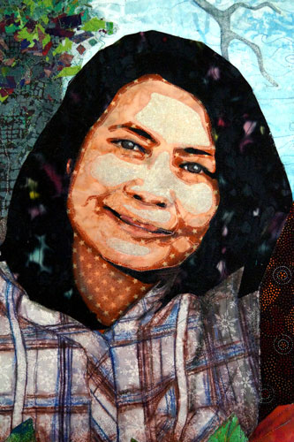
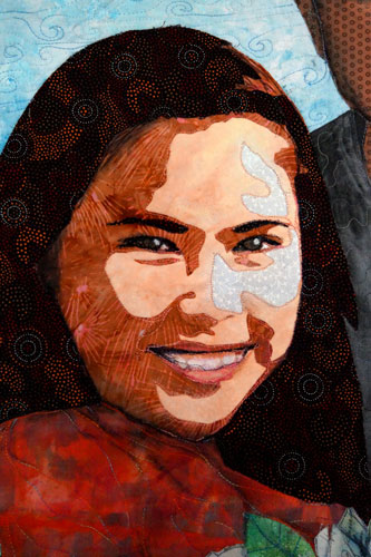
My daughter Erin and her husband Lachlan will be performing ‘the Picola’ song’ at the exhibition opening. Her lyrics beautifully describe how she sees the beauty of her hometown shining through the ‘cracks’. Tammy Muir, our famous local bush poet, will also be performing ‘Ode to Picola’.

The Picola Song                                          by  Erin Lancaster, Lachlan Heycox and Austin Lancaster

Don’t know what’s changed since I was thirteen
In that old dusty town where I grew up
But I’m on my way
Like an abandoned movie set
In an out of date western once relevant
Now it’s full of cracks

Cracks in my mother’s forehead as she embraces me on the verandah
It’s been a while

Chorus
As flat and dry as sunburnt toast
Every time I come home I see the cracks
But the sun still spills over everything
And I smile and love seeps through the cracks

The pub’s been up for sale for years
The station rusts as men sit around
But don’t say a word

Teenage mothers teach their kids to swim
In the public pool now clogged with bugs
Their smiles make cracks

Chorus

The chemist lady asks me how I’ve been
Living in that big city following my dream
She knows my name

I’m missing my ticket for the morning bus
The bus driver opens the door and smiles and says
I’ll get you home


Blue-sky,-red-dirt,-yellow-Billy-Buttons

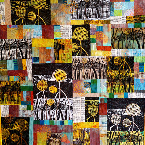
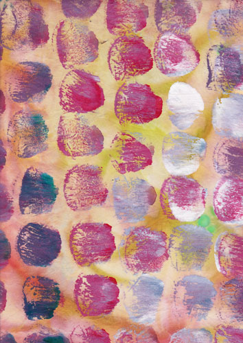
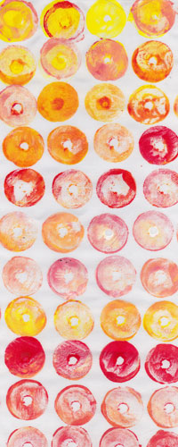
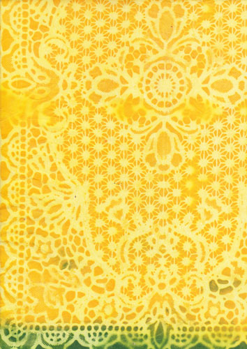
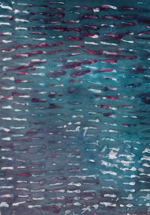
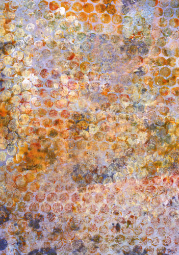
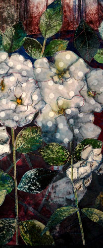
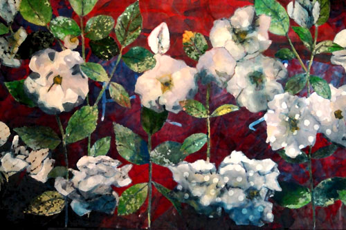
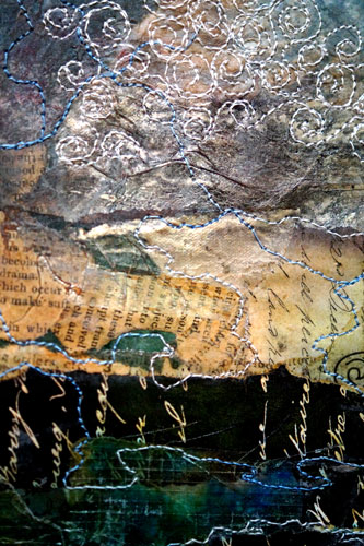
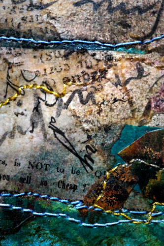
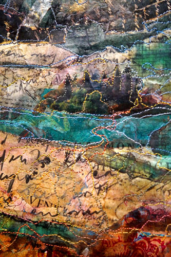
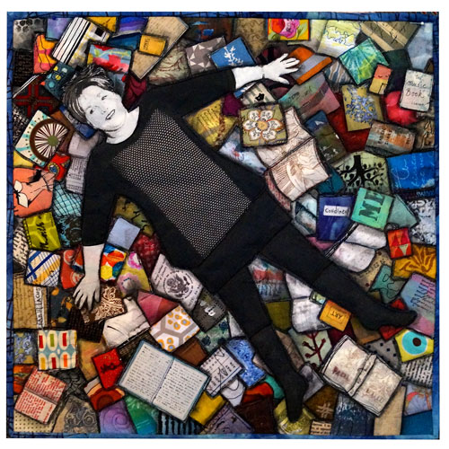
‘Blue sky, red dirt, yellow billy buttons’ by Linden Lancaster 2014 30 x 32 inches

The above quilt called ‘Blue sky, red dirt, yellow Billy Buttons‘ is a piece I have just finished for the above  exhibition at the G.R.A.I.N store, an art gallery in close-by Nathalia.

I have used a linocut of billy buttons (Picola is not know for billy buttons but there are a few that grow down our road) as a starting point. The work was then pieced together with hand dyed fabrics. The quilting added more line and texture over this improvised pieceing. This is a first piece in hopefully a series on these gems.

For further information in the G.R.A.I.N store:  http://www.thegrainstore.org

detail-1

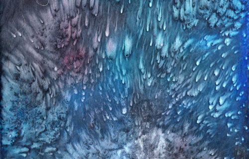
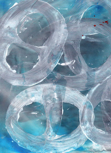
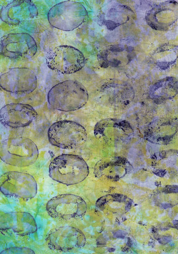
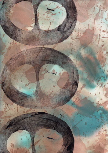
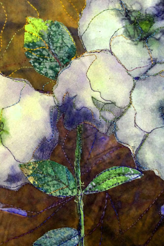
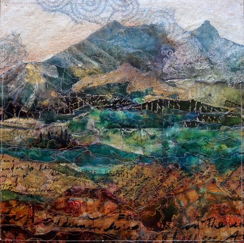
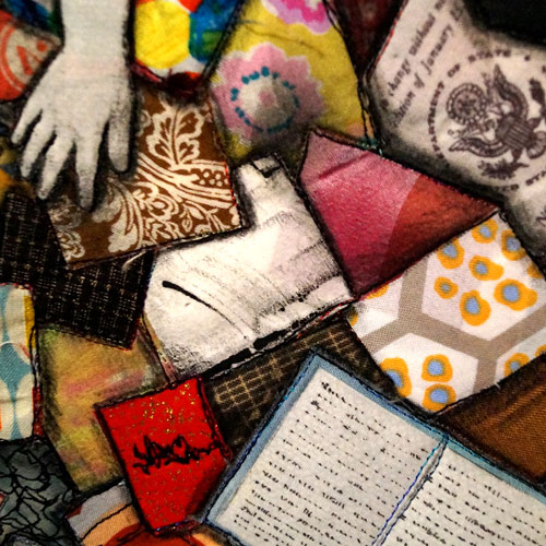
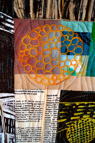
‘Blue sky, red dirt and yellow billy buttons’ detail 1 by Linden Lancaster 2014

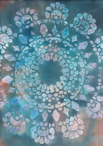
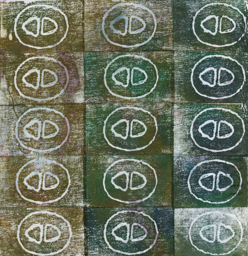
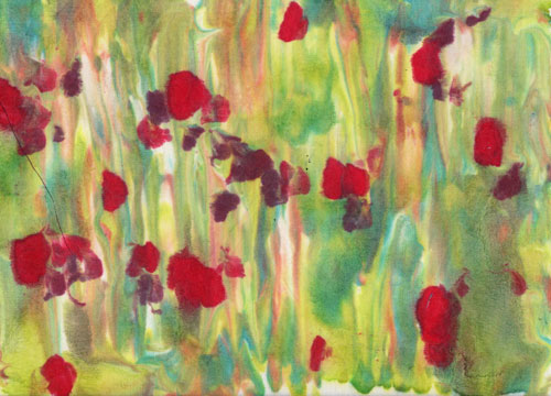
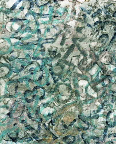
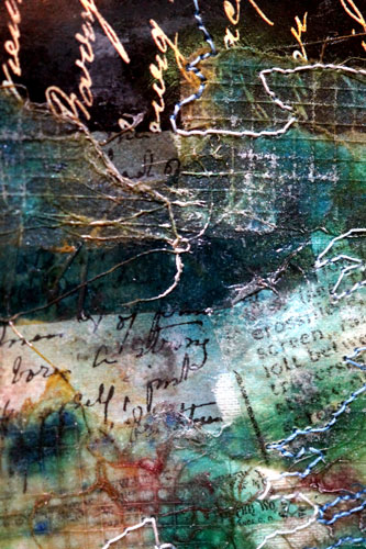
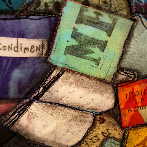
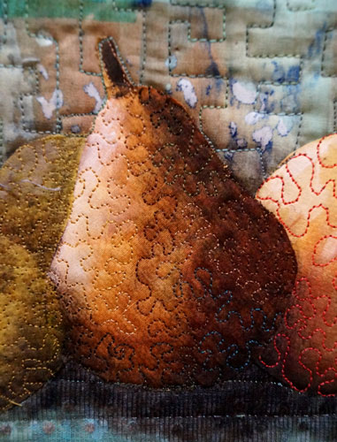
‘Blue sky, red dirt and yellow billy buttons’ detail 2 by Linden Lanacster 2014