Monthly Archives: March 2018

A WORK IN PROGRESS: ‘SEASON AFTER SEASON’ A personal journey. Part2: Feb 2018

Standard

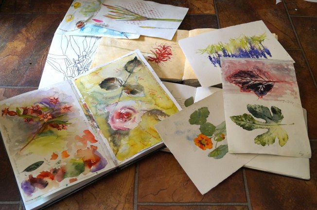
Developing ideas in the artists journal

Not putting too much pressure on myself to make ‘good art’, but trying out ideas with different media. Getting a feel for the subject in other words.

aggas

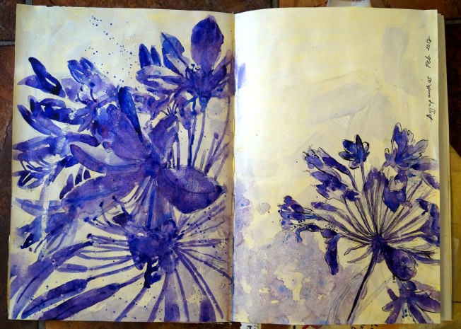
Agapanthis in different scales. White pastel resist with watercolour, pen and ink (nib). I like the combination of line and organic form and that it gives the impression of the flower without being overworked.

bluebells

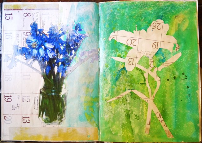
Photo of blue bells collaged over calendar. Gesso has been used to soften the design.

Second page has been given as wash with then a Lillium flower cut from the wrong side of a calendar page. It was chosen for its good shape.

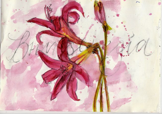
I don’t think I will use green.

Zoe-Frank

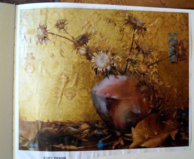
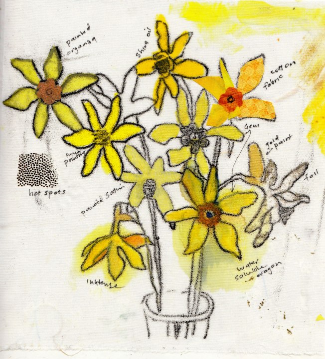
Colour notes. I love this gold back ground with a limited colour scheme of yellow, white, burnt umber, burnt sienna and blue.

crocus1

A photo copy of a drawings of crocus pasted onto a coloured background.

I have used ‘All purpose’ inks to colour the flowers. The inks are useful for building up layers of opaqueness and can be used on fabric.

kids-foam

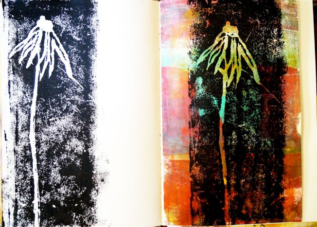
Printing with kids foam. Flower incised with knitting needle. Black paint is rolled over the foam and printing into the sketch book. The second page has left over paint brayed from another printing project.

scrapbook

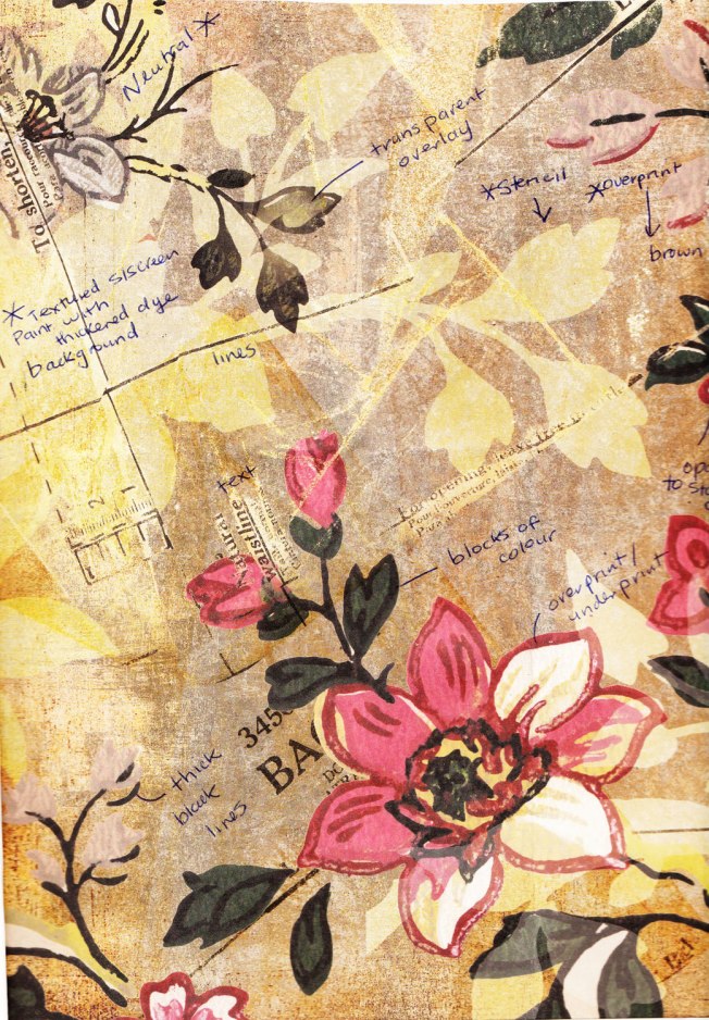
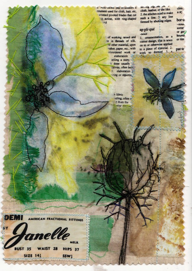
This piece of scrap booking paper is layered, with negative and positive shapes. The background has subtle text and lines from an old dress pattern.

globe

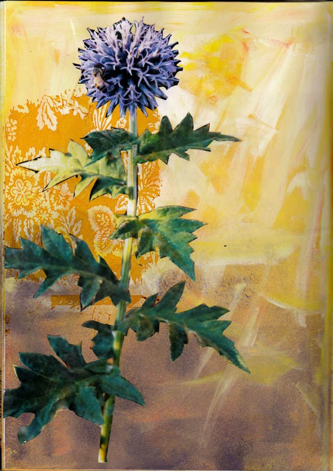
Photo pasted onto a smudgy background with gold transfer. The leaves have good shapes.

quince

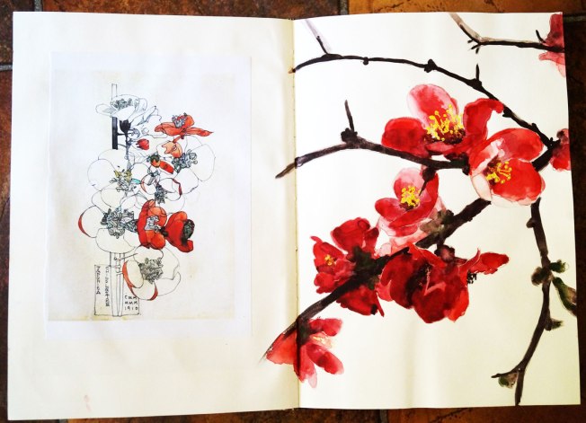
This flowering quince comes out in August (late winter) when there is little else around. It is a tough and thorny bush. Watercolour and oil pastel resist (stamens). Charles’s drawing on the left is more stylized and has only colour in some of the flowers. I like this look.

Using Photoshop to convert my own photos to line drawings is useful, but does not have the charm of a direct observational drawing.

IMG_20180323_0004

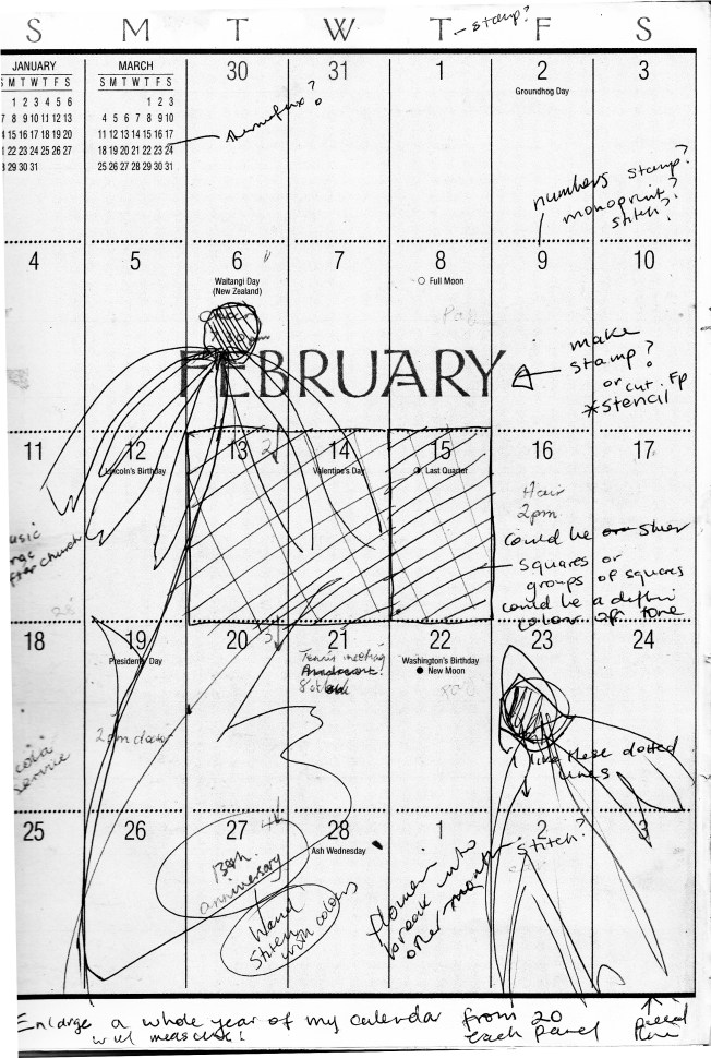
Each month of the calendar will be enlarged and printed out. They will then be joined together to make the background of the master pattern. The design will have to be extended to fit in with the size parameters.

IMG_20180323_0005

Initial notes – everything is going into this book!

A WORK IN PROGRESS: ‘SEASON AFTER SEASON’ A personal journey. Part 1

Standard

One of my aims every year is to enter a piece in a SAQA (Studio Art Quilt Associates) call for entry.

This year the topic of ‘Season after season’ looked most appealing.  The premiere location is Texas Quilt Museum. Each accepted piece of work is to have an accompanying artist’s journal which explores the artist’s journey from initial thought and concept to final artwork- something I’ve always wanted to do. This is the first time I have shown a work in progress in public from start to finish. The risk is of course that the piece may not be at all successful. I’m thinking that this experience will be a lot more enriched by sharing my thoughts and processes along the way- a win-win situation whether my work is accepted or not. I hope you will find it interesting….

GATHERING IDEAS AND INSPIRATION

A collection of sketchbooks with drawings and water colours of flowers from my garden

sketchbooks

Photos in my ‘garden journal’ and ‘still life’ files:

A few samples from other projects:

sample-1

Mono-printed black lines with colour trials

sample-2

Stitched photos on fabric from sketchbook. Organza, a non-woven and TAP.

sample-3

A sketch book page printed directly to silk.


Other ideas:

Garden diaries and lists of plants

‘A Country Ladies Diary’

Seasonal colour

Old and new calendars- I have never thrown out my calendars and have over20 years’ worth (somewhere in the cupboard).

Poetry about seasons and/or flowers


Some artists who work with florals

Charles Rennie Mackintosh

I love the way he leaves some of the flower/plant not coloured in. His line work is to die for!

Kurt Jackson

His work is very organic. The flowers are not explained too much and are nice and loose. Texture and line.


Chinese botanicals

I like the antique parchment look of the background combined with the lively brushwork.


Hitoshi Kobayashi

My latest favourite discovered form Pinterest. Beautiful depictions of flowers standing out from gold, speckled or grungy backgrounds.


Robert Kushner

Interesting use of blocks of colour and line interwoven with floral theme. Great use of pattern and line, negative and positive. Thick and thin outlines could be described as stitch or applique. Also use of text.

CONCEPT DEVELOPMENT

As I was going through all those calendars mentioned above, I picked out a possible candidate that had nice printed text in Art Noveau style. When I looked closer at the actual hand-written notations, I became rather nostalgic and my feelings became mixed. This particular calendar was from 2001 and I realised that two beloved fathers and brother had passed in that time. My sister’s baby which was due is now a beautiful year 12 student. There were lots of banal appointments and running children to various activities (how did we do all that). These children have long flown the nest. Even my own bodily functions had changed! (no more marking 28 on the calendar, yay).


MAIN IDEA

My life marches ever onward never being the same.

BUT

The flowers in my garden always come out season after season.

Chrysanthemums for Mothers’ day, Easter daisy, winter gladiolus, autumn crocus, white Christmas lilies, Spring bulbs……

This gives me a sense of comfort.

How often do we get tied up in the busyness of our lives and forget about those little treasures peeking out from the earth all around us season after season?