‘Bird Brained Balance’

Standard

DSC00447

DSC00451

DSC00448

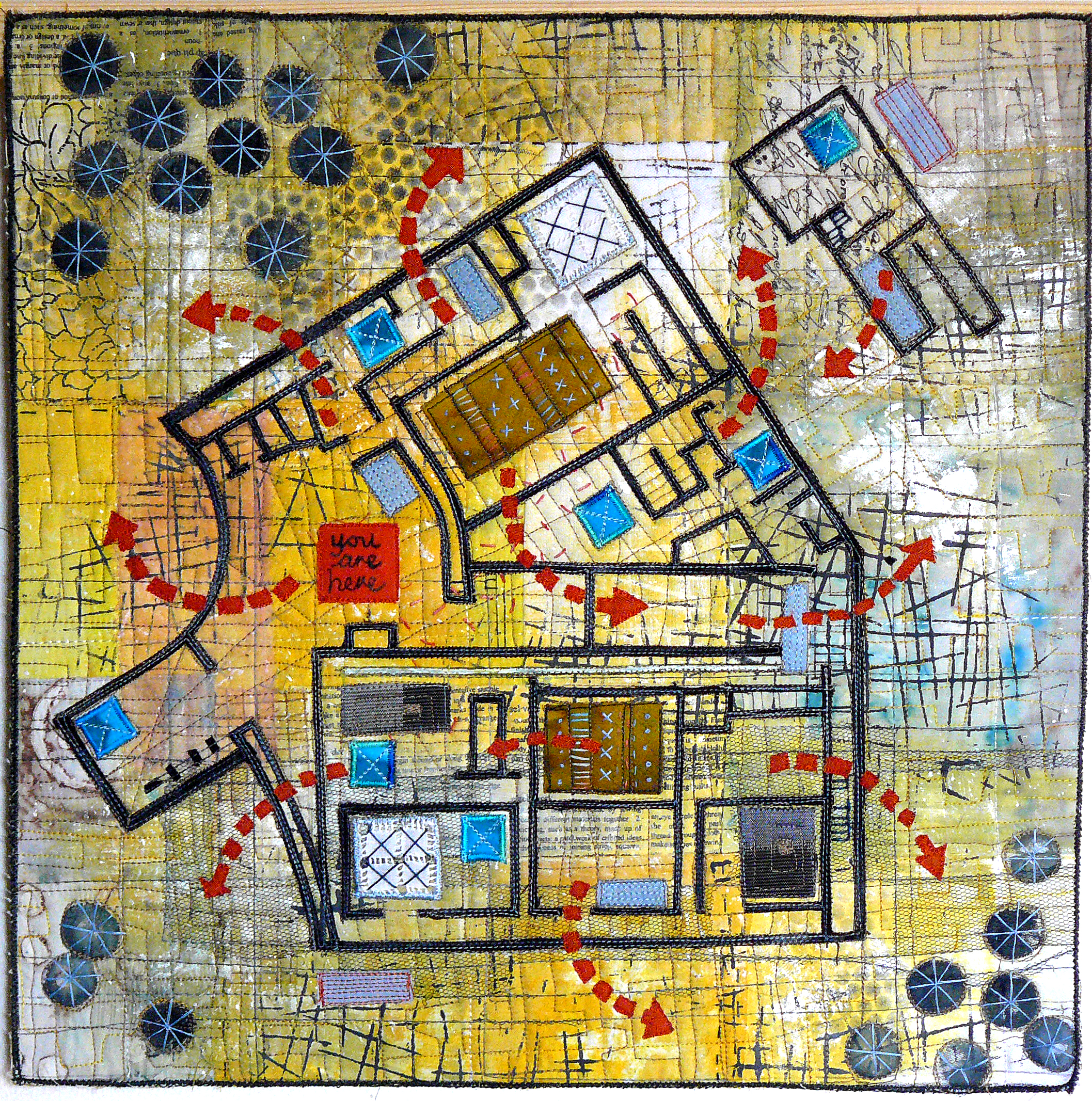
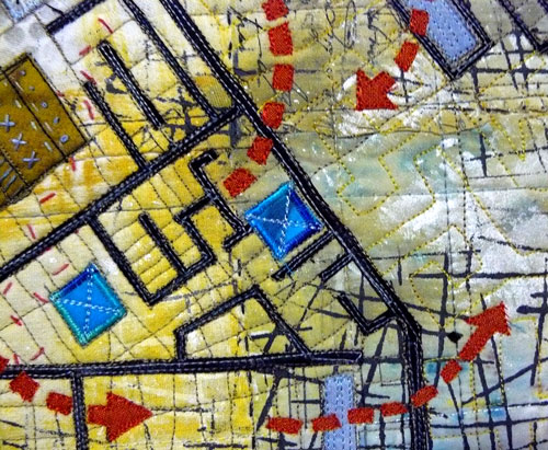
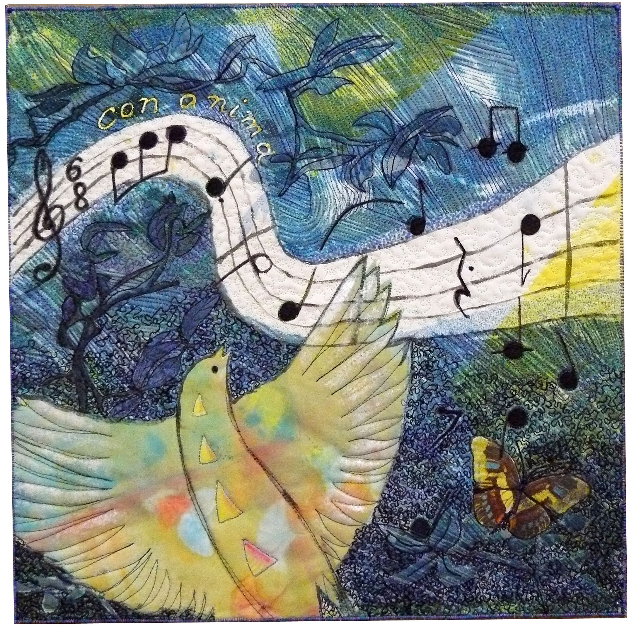
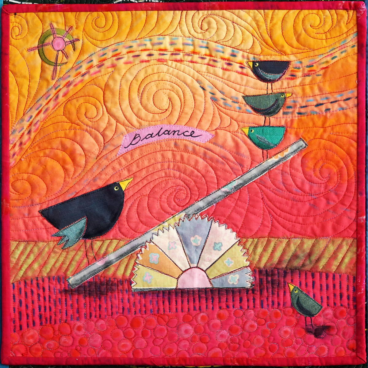
Latitude challenge quilt number 7: ‘Balance’.

I had this image in my mind the minute the theme was announced! I set some parameters for myself that the piece would be whimsical, using bright pinks and oranges and fresh (i.e. not overworked).

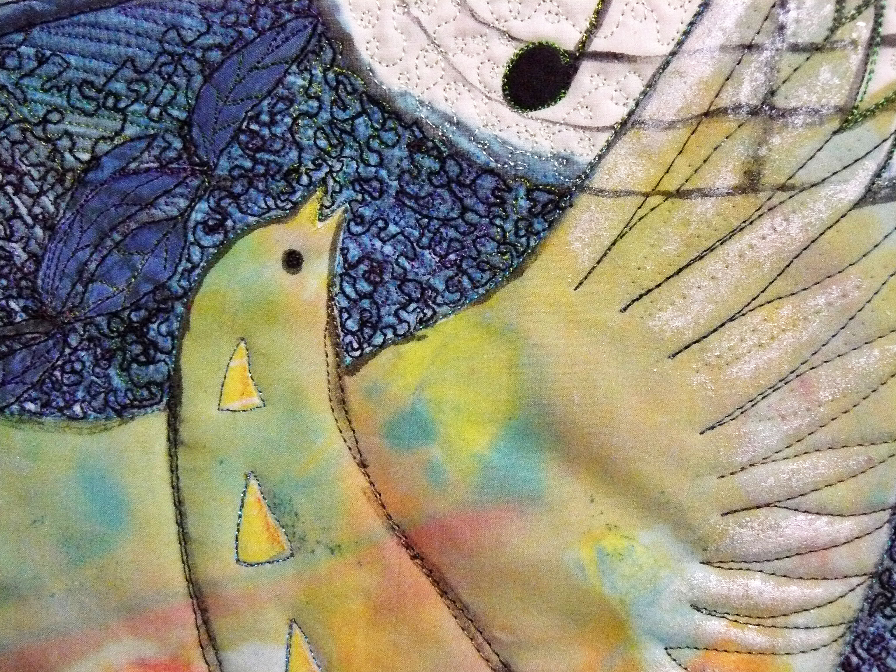
I spent some time playing with bird forms in my sketchbook and came up with their ‘attitudes’, which would be very important as it was to be repeated in the overall design. I’m sure I have been influenced by childrens’ picture books, having worked as a teacher librarian for many years. John Birningham comes to mind.

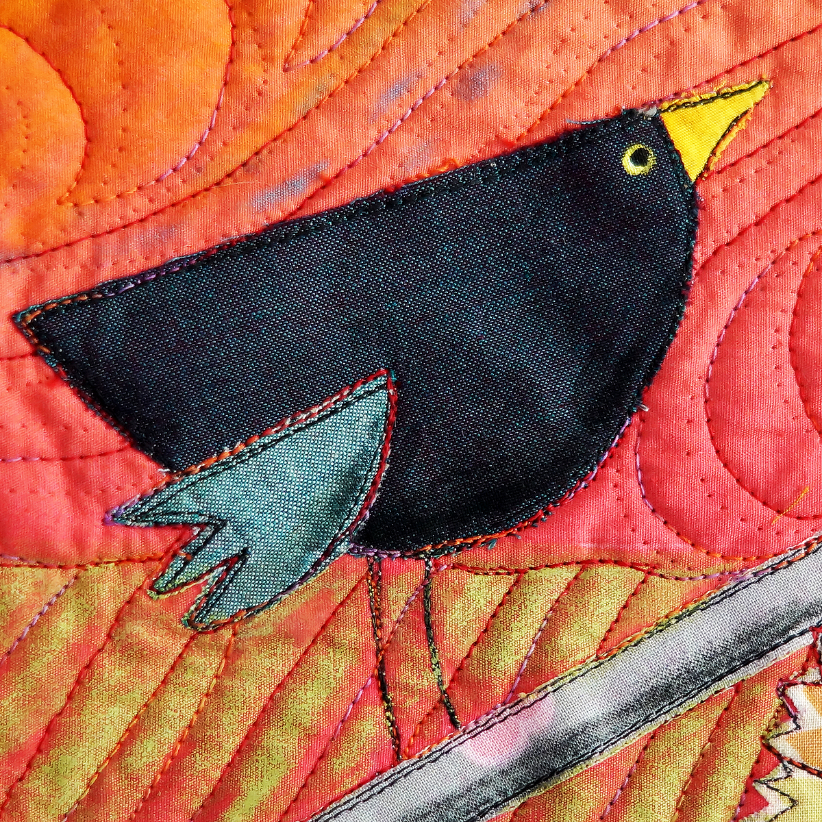
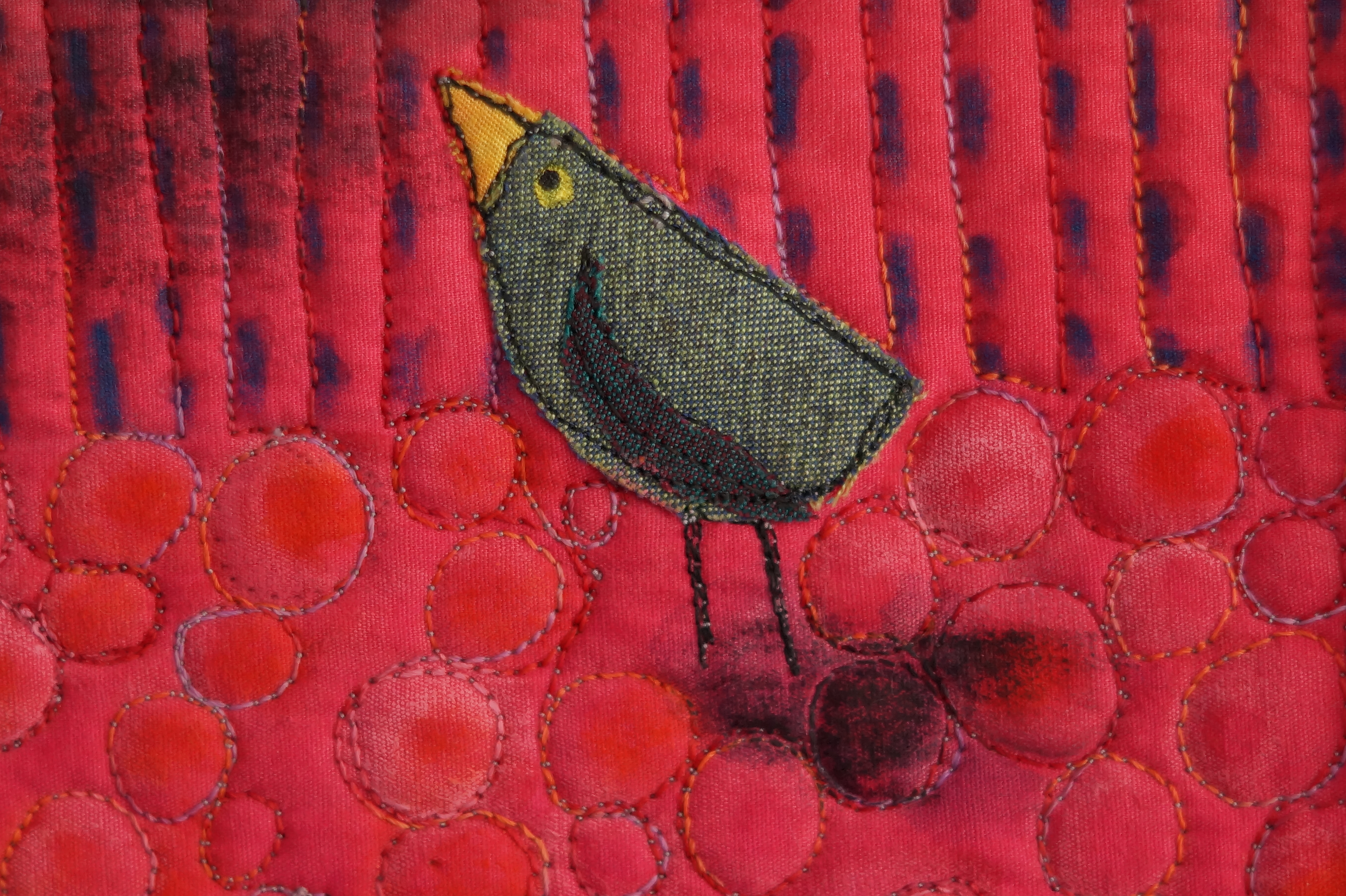
It took some time to find a graduated pink and orange graduated fabric in my stash. I then had to find fabrics that would contrast for the main elements. I used some lovely shimmery cotton that looked like silk in cool colours for the birds and a pastel Kaffe Fassett design for the see-saw. Then it was a matter of fusing and thread-sketching the pieces into place.

Originally I was going to make a stamp to make different patterns on the sky and ground. I think this could have looked very effective, but time was short and this would have taken quite a bit of trial and error. I used the Caran d’ache water soluble pastels instead.

I’m afraid I did not put a lot of thought into the quilting and ended up using my latest ‘default’ free motion pattern. It gives a feeling of movement to the piece, but I’m not sure if it depicts the naive style I was going for.

Having finished the piece I felt there was something missing around the centre. I then added the word ‘balance’ (even though the birds are not balanced), and leaving it for the viewer to work it out. It also hid a wobbly bit of quilting!

If I were to make this quilt again I would not use the water soluble pastels. I think they look messy in the shadows and the lines in the sky. The stamping/printing could have helped to make the piece have cleaner lines.

It would be great to make a little series of these with the brainless birds doing other things with play equipment. I think they would be a nice addition a child’s room or nursery.

‘Escape Plan’ ….Latitude challenge No 6

Standard

Escape Plan Nov 2013 Escape-Plan-detail-1.jpg-web Escape-Plan-detail-2.jpg-web
After reading about collage process used by Valerie S. Goodwin, I decided to make an
Art quilt map’ to fit in with this theme of ‘escape’. The building plan I have used is fictional and has no particular significance.

My primary intention of this piece was not so much in interpreting the theme, but to present a visual buffet of shape, line, texture and colour.

The collage process was quite an easy and enjoyable one.
1. Light coloured fabric were cut (or torn) and sewn onto a substrate (I used felt) with a contrasting thread. Some rough edges were left.
2. Chunky hand sewing was then added in a random way to give this background some extra texture.
3. Fabric paint (in this case yellow and pearl white) was added sparingly with a brush to unify patchwork pieces together. I also added a thermofax stencil and sequin trash stencil later on.
4. A few sheer fabrics were then applied with misty fuse. I used tulle and pink silk organza.
5. The linear and rectangular elements of the plan were then fused into place and thread painted.
6. The backing was added and the whole thing quilted.
7. More hand sewing, such as the stars on the trees, was added to give the final touch.

I decided that a traditional binding would be too heavy for the piece. The work needed to have a thinner frame, so I decided to try a method by Terry Grant (of ‘The 12’s) of zigzagging over pearl cotton. I thought this worked well, although I found it a bit tricky to keep the couching straight. Perhaps there is a special foot you can use?

I like the colours of grey, yellow and blue, but I’m not too sure about the orange arrows? Perhaps they would look better as a blue-red….perhaps I’m being too fussy!

There were some design issues that has to be dealt with. The walls of the plan were very heavy. I tried to counterbalance this by offsetting them with the trees in the corners. I also try to ‘knock them back’ with thread and I completely painted over one of the inside walls!
It was also difficult to get the arrows to look balanced. I added the “you are here” (against my husband’s advice) as a focal point.

I enjoyed doing the hand stitching for a change and it really took no time at all. I think I would like to make another piece of a place that I identify with– something with paddocks, rivers and dirt roads. I also like the idea of adding your own poetry, like a Haiku.
I would recommend this book/process for any of the Latitude girls to try, even if, like me, you think it is not your ‘thing’.
Linden Lancaster

‘Over the fence’ Vic quilters challenge 2013

Standard

The rabbit-proof fence completed in 1907 was built to protect Western Australian crops and pasture lands from the destructive scourge of the rabbit. The number 1 Rabbit Proof fence was the longest line of unbroken fence in the world, stretching 1,139 miles. The fence represents a unique, if inadequate, response to an over whelming environmental problem.

This is a recently completed piece made for Victorian Quilters challenge for 2013 which is currently travelling the country.  The rabbit in the front is looking at us as if to say” I’m going over there and you can’t stop me”.  I have used tiny pieces of hand cut cotton fabric to build up a collage of the rabbit which were glued down and sewn over. The background is pieced with a mixture of commercial and hand dyed fabric. It was difficult to get the fence right. After some trial and error I ended up free-motion quilting the wire with a darkish grey thread. The crows were added to balance the design.

You might notice the rabbits over the fence in the distance gallivanting in forbidden territory!

P1150014

Rabbit Proof Fence? by Linden Lancaster 2013


‘Dorothy’s Quinces’

Standard

My Mother-in-law grows these wonderful fruit from which we make jelly and paste. This is a piece I have done using a raw edge/confetti technique. Each tiny little piece of fabric in the quinces and leaves were hand cut and glued on one piece at a time. I tried to pay attention to the tones of the fabric to achieve the correct forms fo the fruit. The work was free-motion sketched in variegated threads. I was pleased to try out a quilting design called ‘McTavishing’. It was a great design to fill and improvise around elements. The botanical text was done using a freezer paper stencil and ‘Shiva sticks’. This work will be on display (and for sale) in the Nathalia Art Windows (The G.R.A.I.N store) from December 2013 to early Jan 2014.

Dorothy's Quinces

Dorothy’s Quinces by Linden Lancaster 2013

Dorothy's Quinces detail2 web

Dorothy’s Quinces detail 1

Dorothy's Quinces detail web

Dorothy’s Quinces detail 2


‘All is Silent….’

Standard

This is my latest offering for ‘Latitude quilts’. The theme was ‘The sounds of silence’.

P1150077

‘All is Silent…’ , by Linden Lancaster c2013

The ‘Sounds of Silence’ was a tricky theme, as there are very few situations where there is no sound. What is it like to be deaf? Is it silent on the moon? Then I thought of the saying ‘All is Silent on the Western Front’. Being an avid reader of first and Second World War history, I remembered the pictures of pastures and woodlands turned into a muddy wasteland. This piece is meant to reflect the silence after the catastrophic winter battles on the Somme. At the recent anniversary of 9/11, I heard about a man who dug his way up and out of a collapsed tower. When he crawled out and looked around, he said what he remembered most was the absolute silence.

Using some reference pictures from books I drew up my own composition. I decided to have a large land mass and small sky. Using this drawing I made a freezer stencil mask. To reflect the sombre mood, there is no colour. I chose a piece of mottled hand dyed grey fabric as my starting point.

I then discharged all the parts I wanted white (the sky and the craters). I then masked them off and applied a shiva stick rubbing over various handmade collograph plates. These were made previously with things such as toothpicks and lace glued to cardboard and varnished. The reflections were added with Inktense pencils. The trees, wheel and fence posts were fused on lastly.

I usually thread paint my pieces with a stabilizer before I layer them up and quilt them. This time I decided to go straight to the quilting. I used horizontal lines in metallic and rayon threads for the puddles. To offset this, the sky was done in vertical lines. The ground was quilted in a heavier variegated thread (Valdini) in a squiggly pattern that got smaller and more horizontal towards the horizon.

I tried to add a canon gun with the wheel, but it just didn’t look right. This perhaps would have added more weight to the theme. I will also experiment more with the barbed wire- I executed it with bobbin drawing this time and I’m not sure whether this quite worked. There must be a better way!

This was a quick and satisfying quilt to make and one I would like to make into a larger and more considered piece. This would be especially significant as the centenary of the first landing at Gallipoli (and subsequent First World War events) is coming up in 2015. My great grandfather was in the first landing of Australian soldiers on April 25th, now our national day of remembrance, Anzac Day.

P1150078

All is Silent… detail

Newest Work: ‘Regeneration, Halls Gap’

Standard

This piece has come from material collected from a holiday I had in Halls Gap a few years ago. It was about eight months after the terrible Victorian Black Saturday fires of 2009. I was taken by the contrast between the blackened trunks and the bright wattle seedlings beneath.I have incorporated some new techniques including monoprinting (background), confetti applique and bobbin drawing (wattle).

18 in x 36 in

18 in x 36 in

Detail

Detail


‘Every Single Day’ challenge number 2 for ‘Latitude Quilts’

Standard

Con anima‘Con anima’ (with spirit)
Every Single Day my life is filled with music…

Con anima close up 2

Con anima close up 1

My intention for this piece was firstly, to break out of my usual way of working and to try some new techniques. I had to keep reminding myself of this as I felt myself drifting back to trying to make a perfect thing.
Being a lover of music, I wanted to convey the feeling of being uplifted into a different world outside of myself. I wanted the piece to be painterly and of an ephemeral quality. I used elements, such as the bird flying upwards, indicating the spirit, and a strain of music, which is escaping from its boundaries, to represent this concept. I cannot imagine spending even one single day without listening to music!

The quilt is a whole cloth created in two layers; one cotton, and one silk organza (I have been keen to work with transparency for a while). I was guided by the techniques mapped out in Melanie Testa’s ‘Inspired to quilt’. Each layer is mono printed with thickened dyes with various resists. The top layer bird and music is hand painted. I made eight at the one time and experimented on each. This was far too many, as I soon got worn out free-motioning all the backgrounds. Next time I could make smaller samples.

One problem was how to make the notes stand out, whilst keeping them in balance with the other elements. I ended up cheating a bit and darkening them with a black fabric marker. I had the same issue with the words. The butterfly was not in the original design and kept vying for attention- I had to knock him back a bit with a stencil brush and grey Shiva stick! I really like the way the quilting follows the brush strokes in the organza; I’ll definitely do that again.
It took a while to work out the best way to quilt the stave. I didn’t feel monofilament stippling would be very interesting and finally settled with shimmering rayon in a horizontal curling pattern. I would have liked to add some hand embroidery, but I thought the background was busy enough with the leaves.

I will definitely incorporate more of these new techniques and materials into my work. I’m hooked on mono printing!

Mother and the Clowns 15’x15′

Standard

Mother and the clowns 15x15

This quilt was made for a challege as part of an online quilt group called ‘Latitude Quilts’. The theme was’Carnival’. This quilt is based upon a photo I took at our local country town’s New Year’s Eve Carnival.
Nearly everyone has had an encounter with these laughing clowns. You might of found them cheerful, magical or downright creepy! I could not resist representing this lovely moment with mother and child. There was a lot of reflected light bouncing around and I loved the way the shiny fake clowns contrasted with the softness of the mother and child.
I used a collage process, first colouring the fabric with crayons and pencils and then fusing all the pieces into place. It was then finished off with thread sketching and quilting.

Mother and the Clowns detail 2

Mother and the Clowns detail 1

Update on latest project ‘Red Gums in Flood’

Standard


Here are a few pics of the latest quilt, a commission for St. Mary of the Angels SC, Nathalia.

I have been adding leaves, to soften the tree trunks and add perspective. The background is being thread sketched with a selection of variegated threads, which is taking a long time due to the large size.

It has been a challenge at times getting the quilt through the machine; I have to do the sketching sideways and upside-down! This is definitely an ‘ugly’ and therefore, scary stage. I’m wondering whether to add a darkish border.

I’m not sure about the title of the quilt….’Red Gums in Flood’ does not sound very interesting–perhaps I will come up with something else by the time I have finished it.