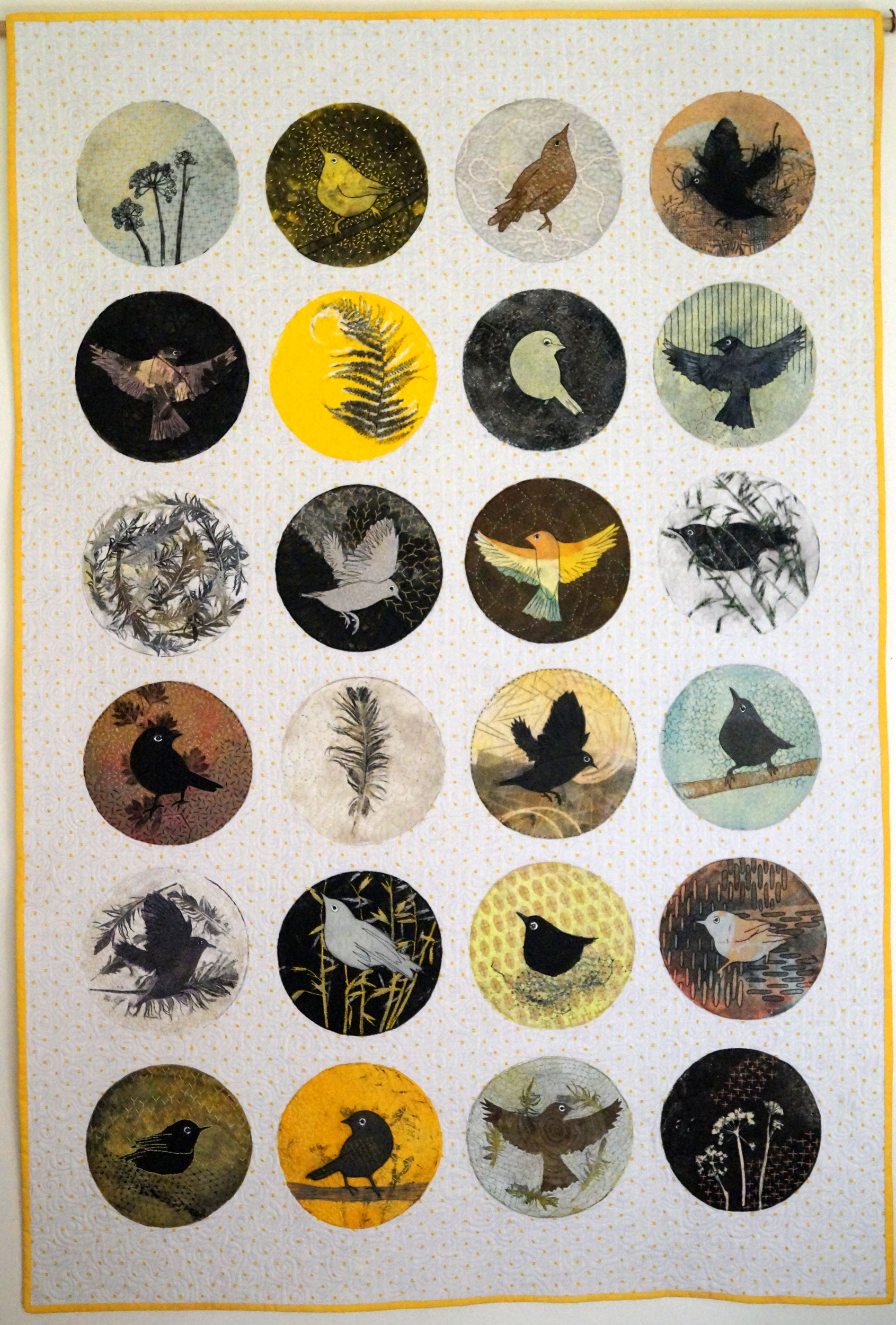
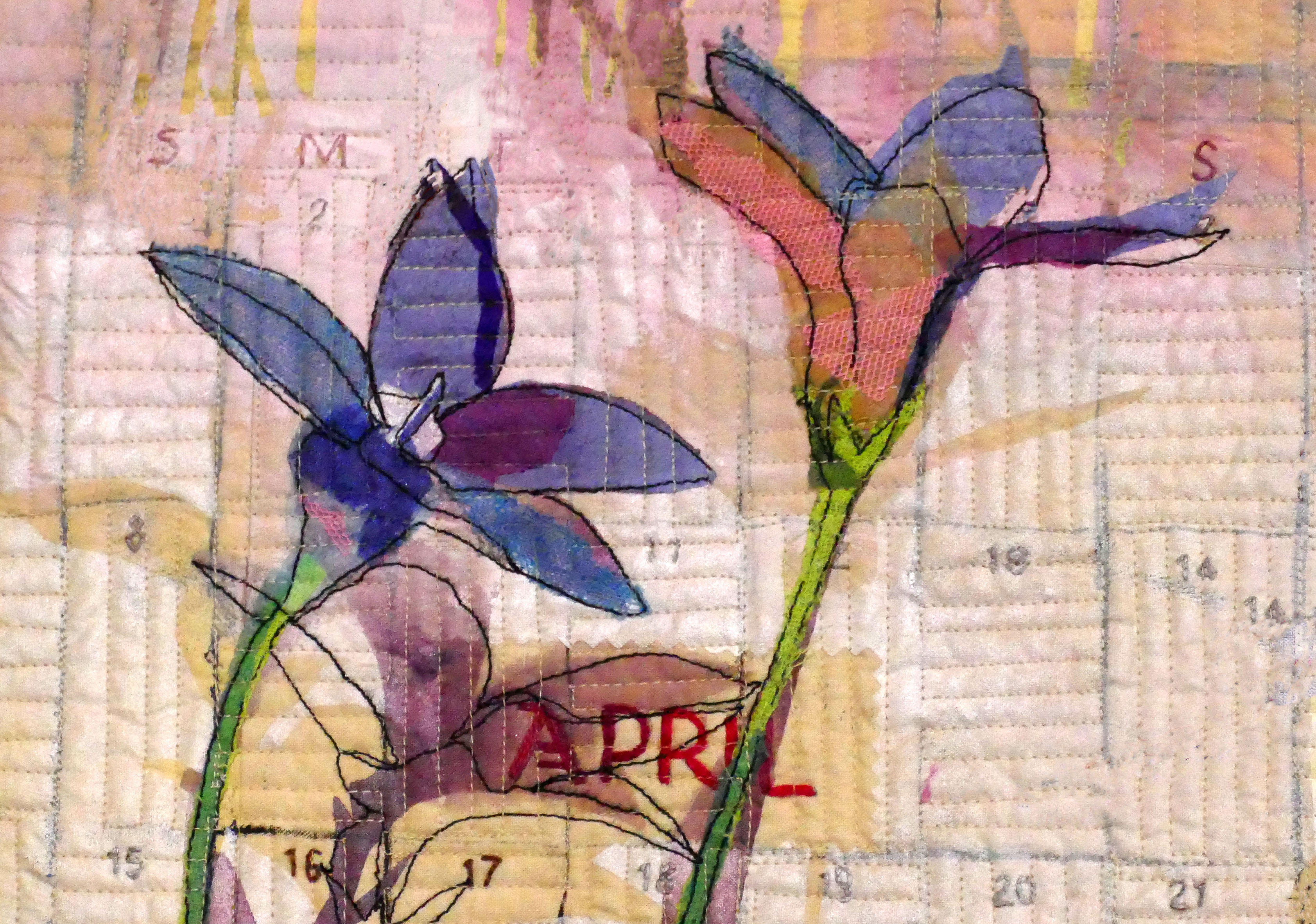
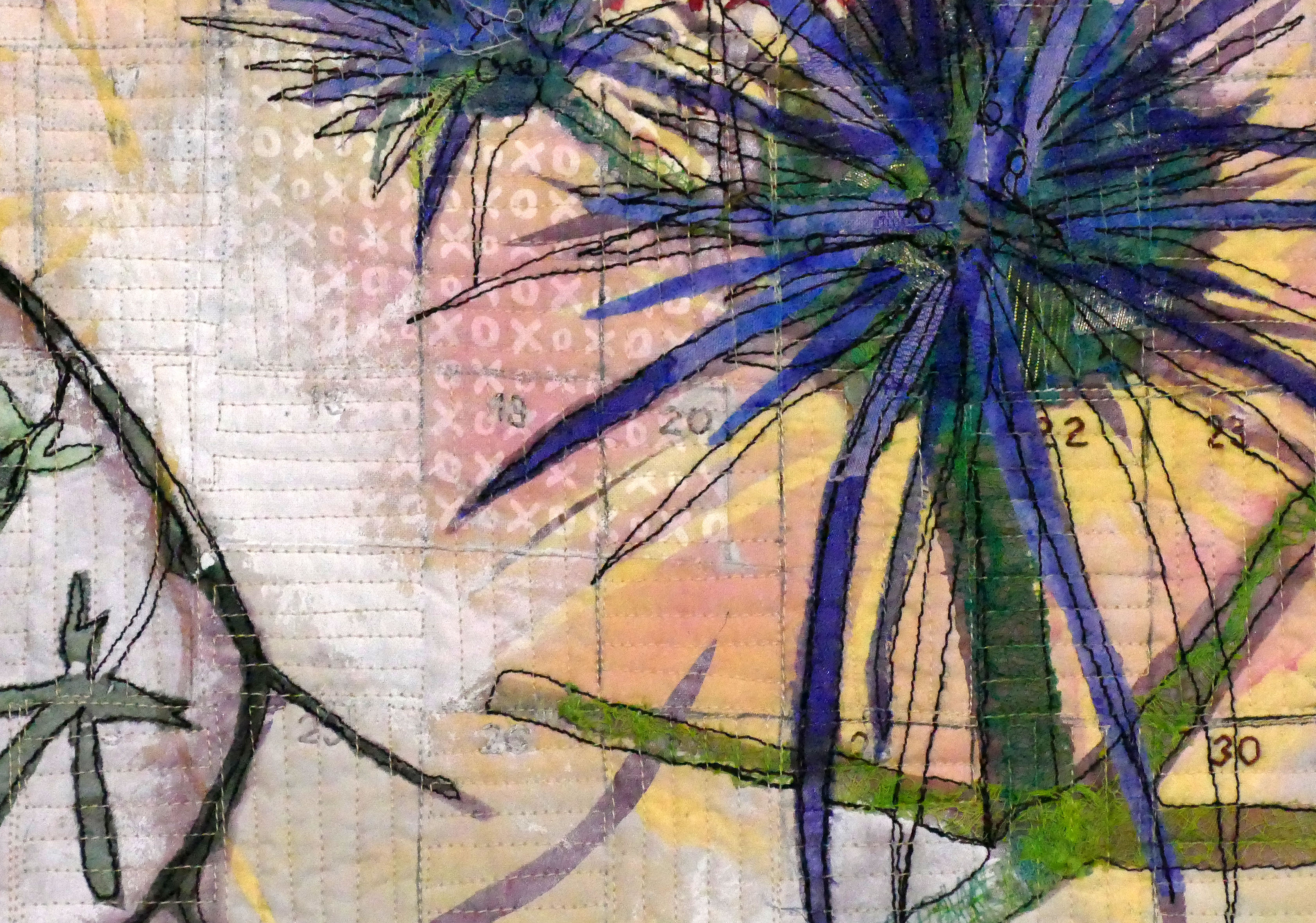
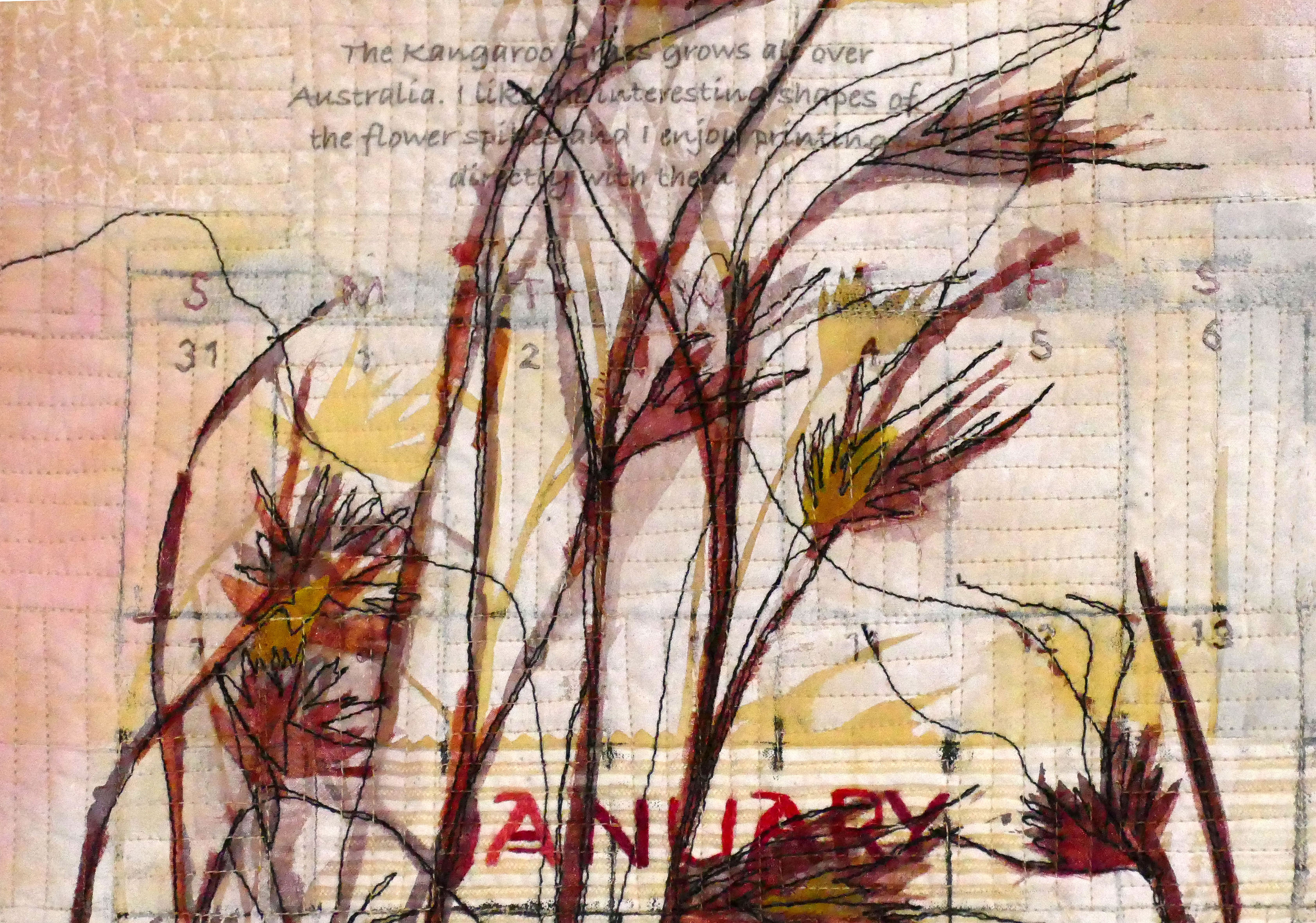
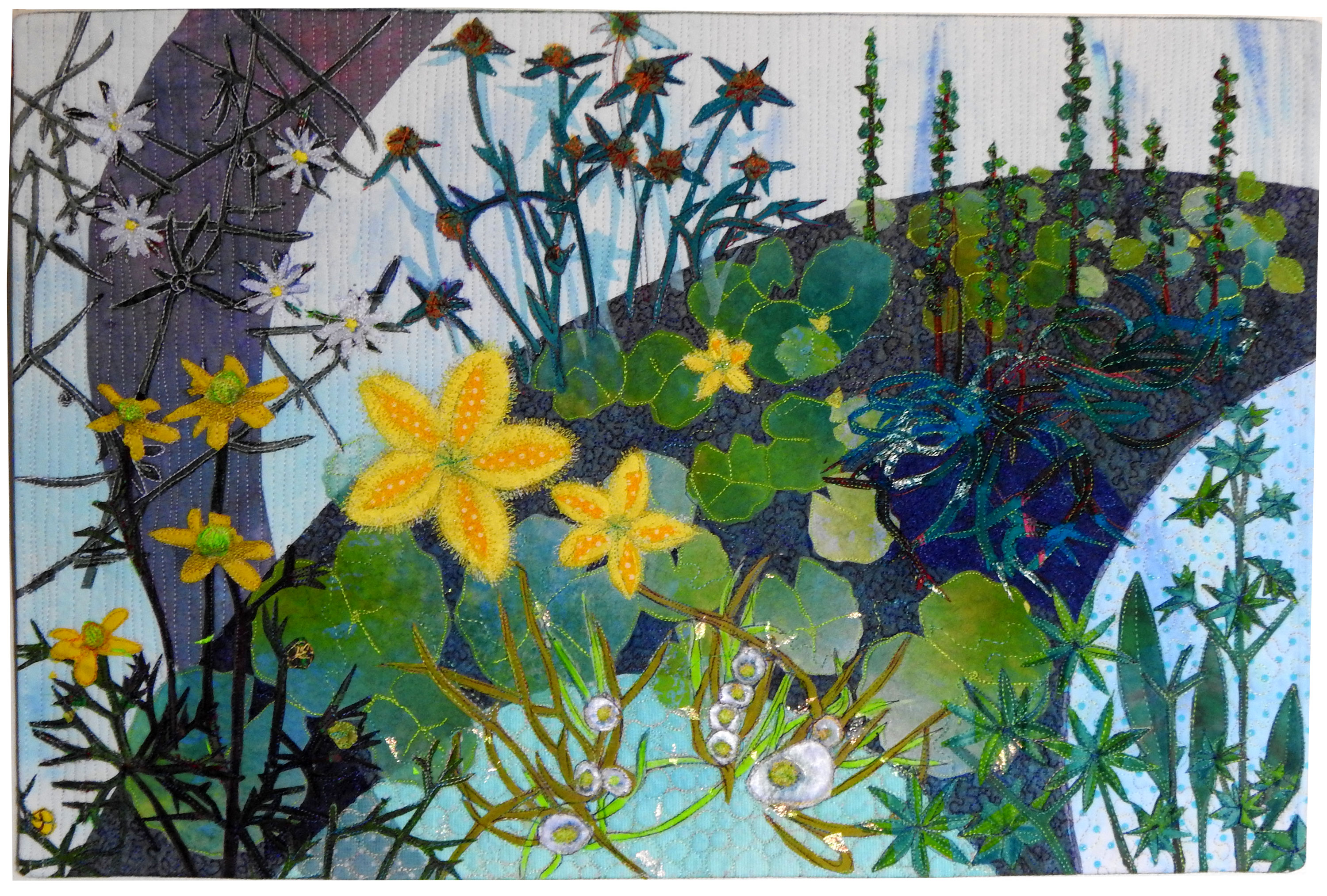
This quilt forms part of my new series of works depicting observations from walks around my property, consisting mostly of birds and wildflowers.
The humble little bird, the ‘silver eye’ is in many gardens and backyards. They don’t seem to be able to compete for artists attention like the blue fairy wrens…..
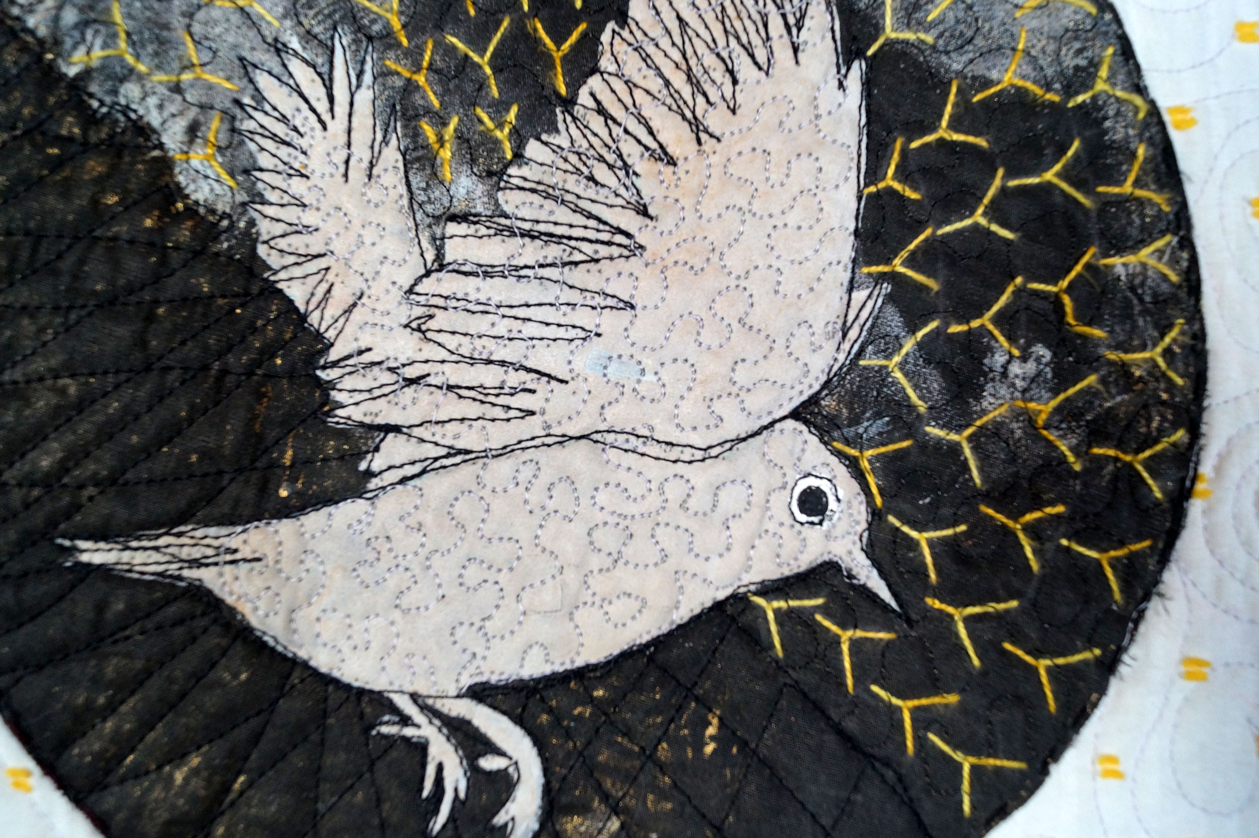
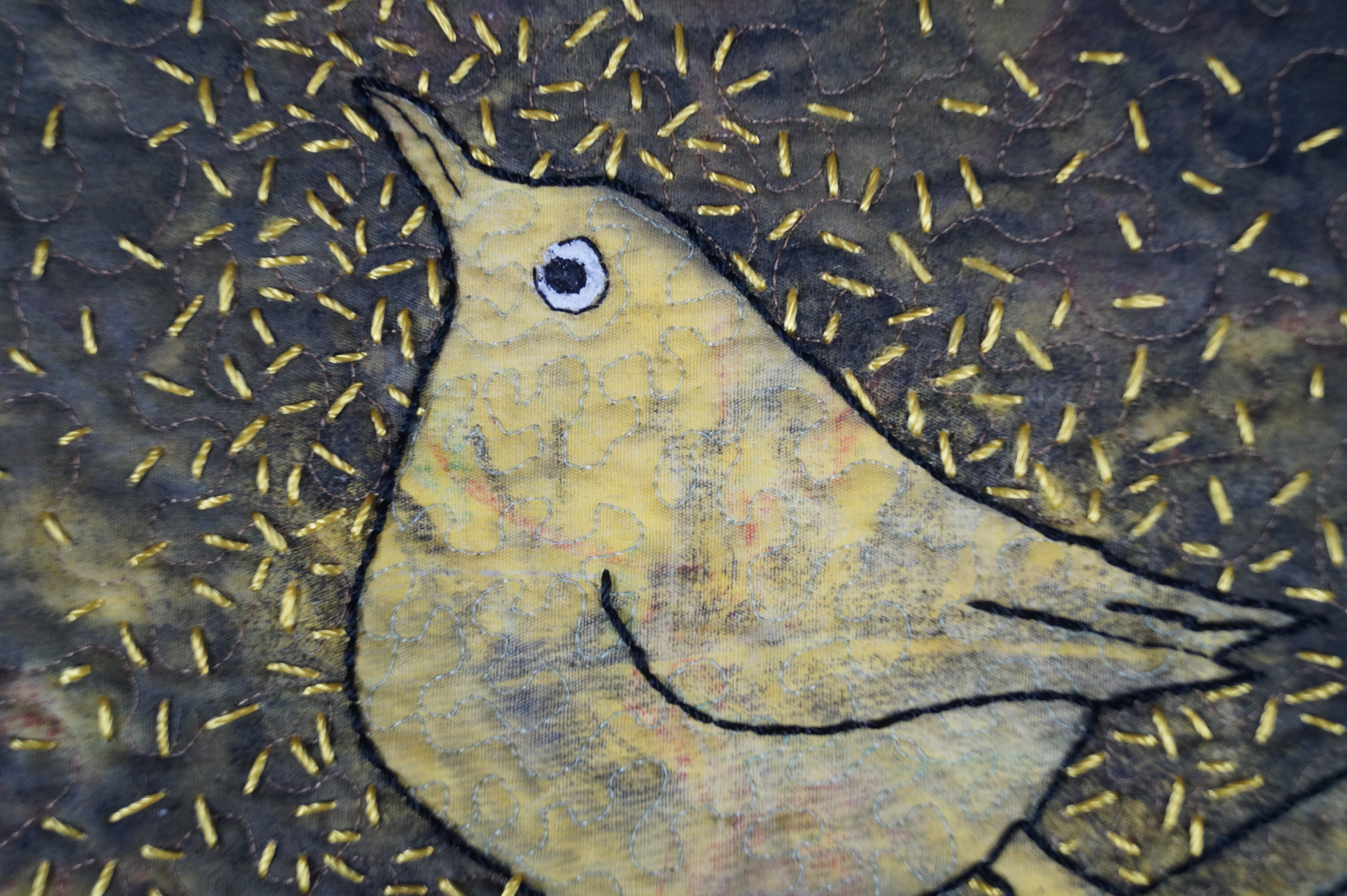
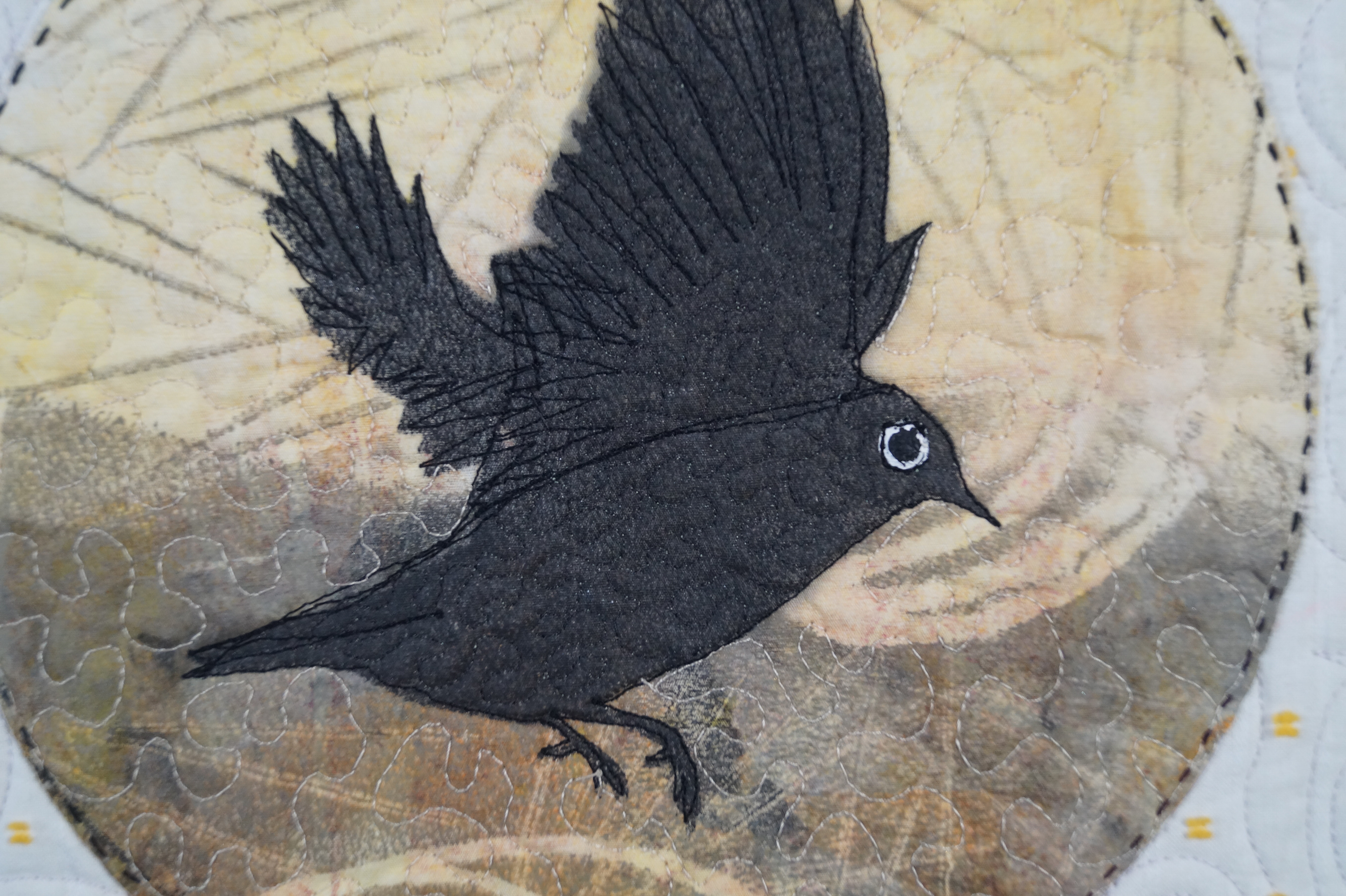
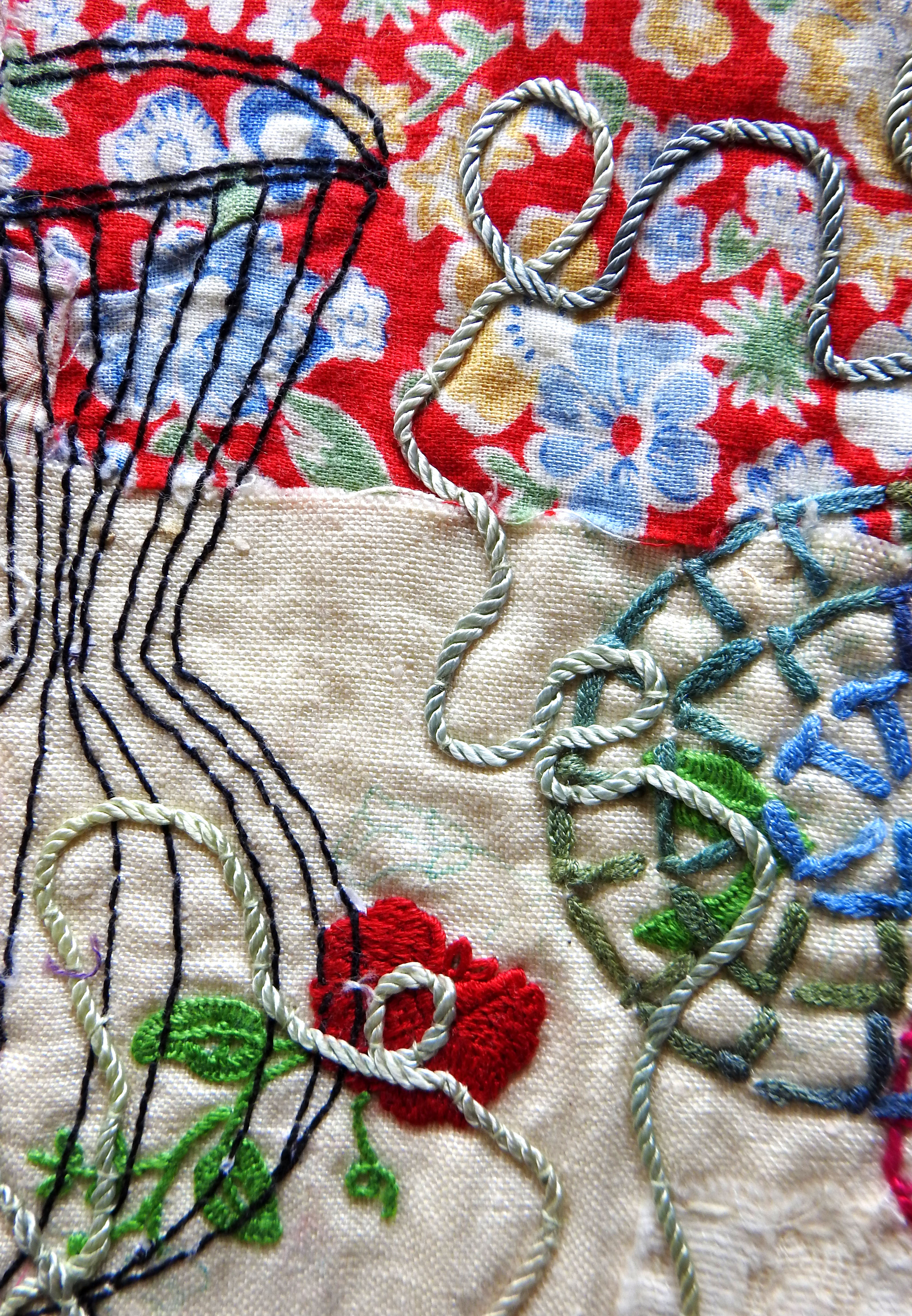
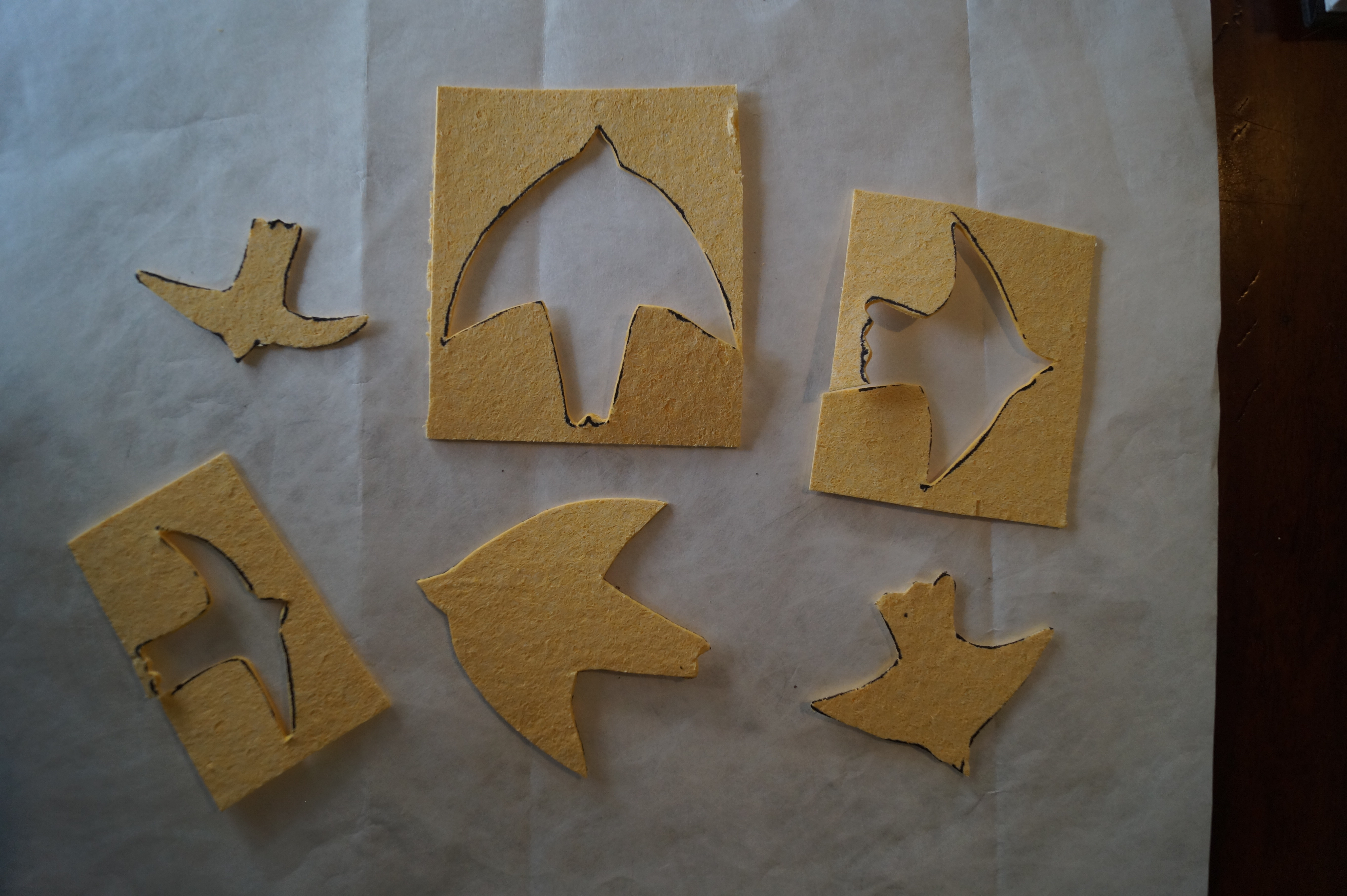
The main process in this piece is mono-printing, using a round geli plate. Feathers were done directly, whilst I used a stencil for the bird shapes. Because this process is quite unpredictable (and more difficult on fabric), only one in four or five work out. I probably did over 100 prints to get the ones shown here!
It is worth it, however, for the delicate and interesting marks that can be produced.
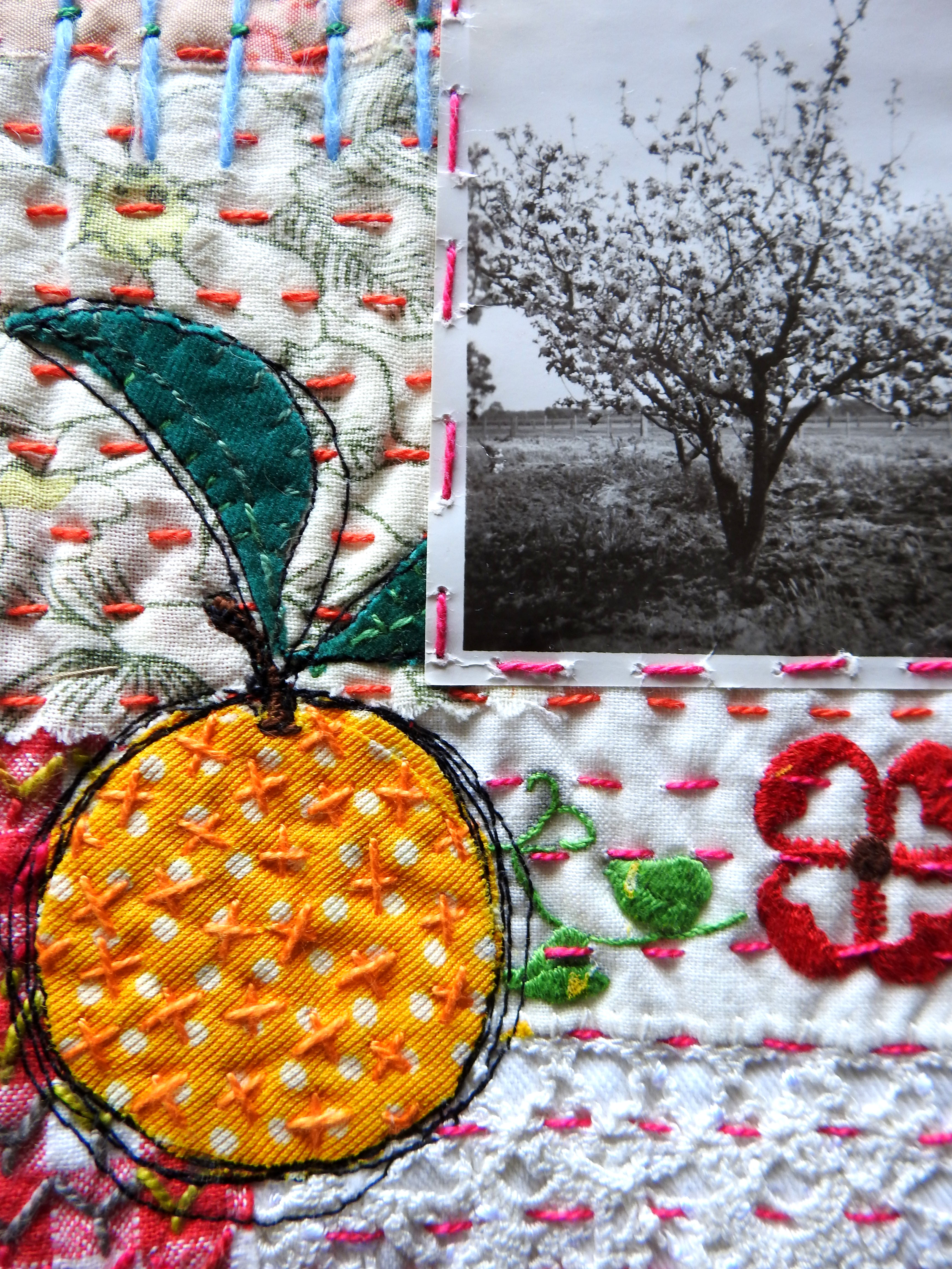
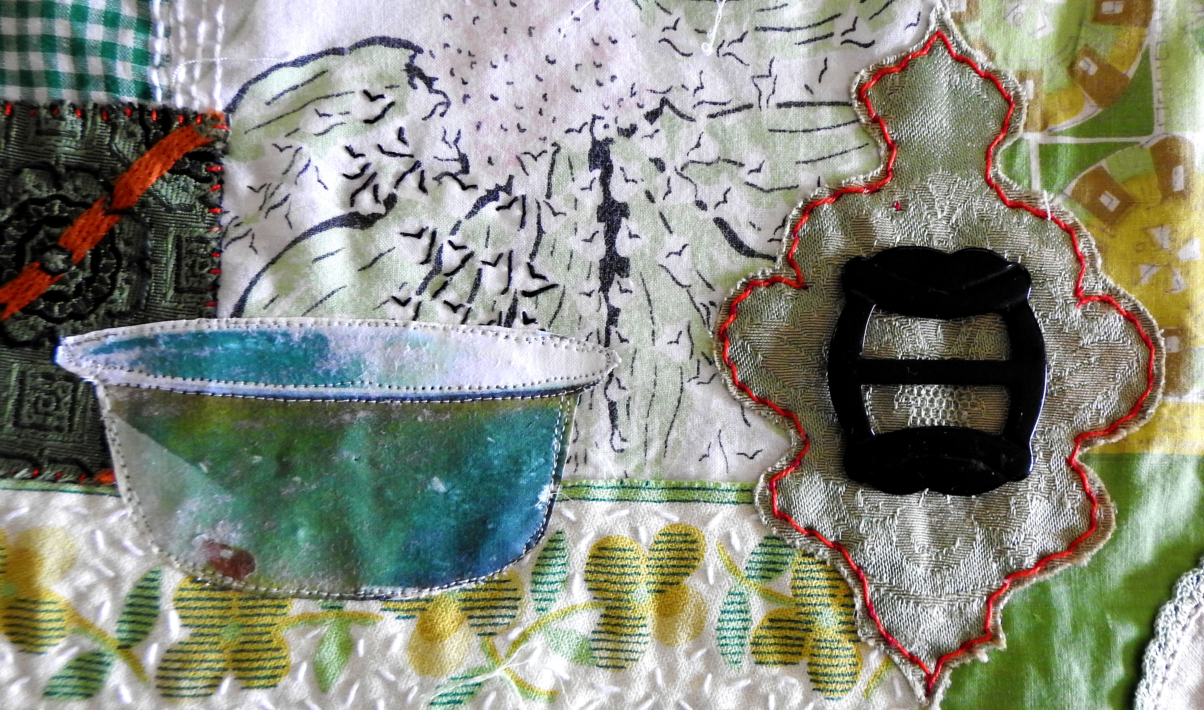
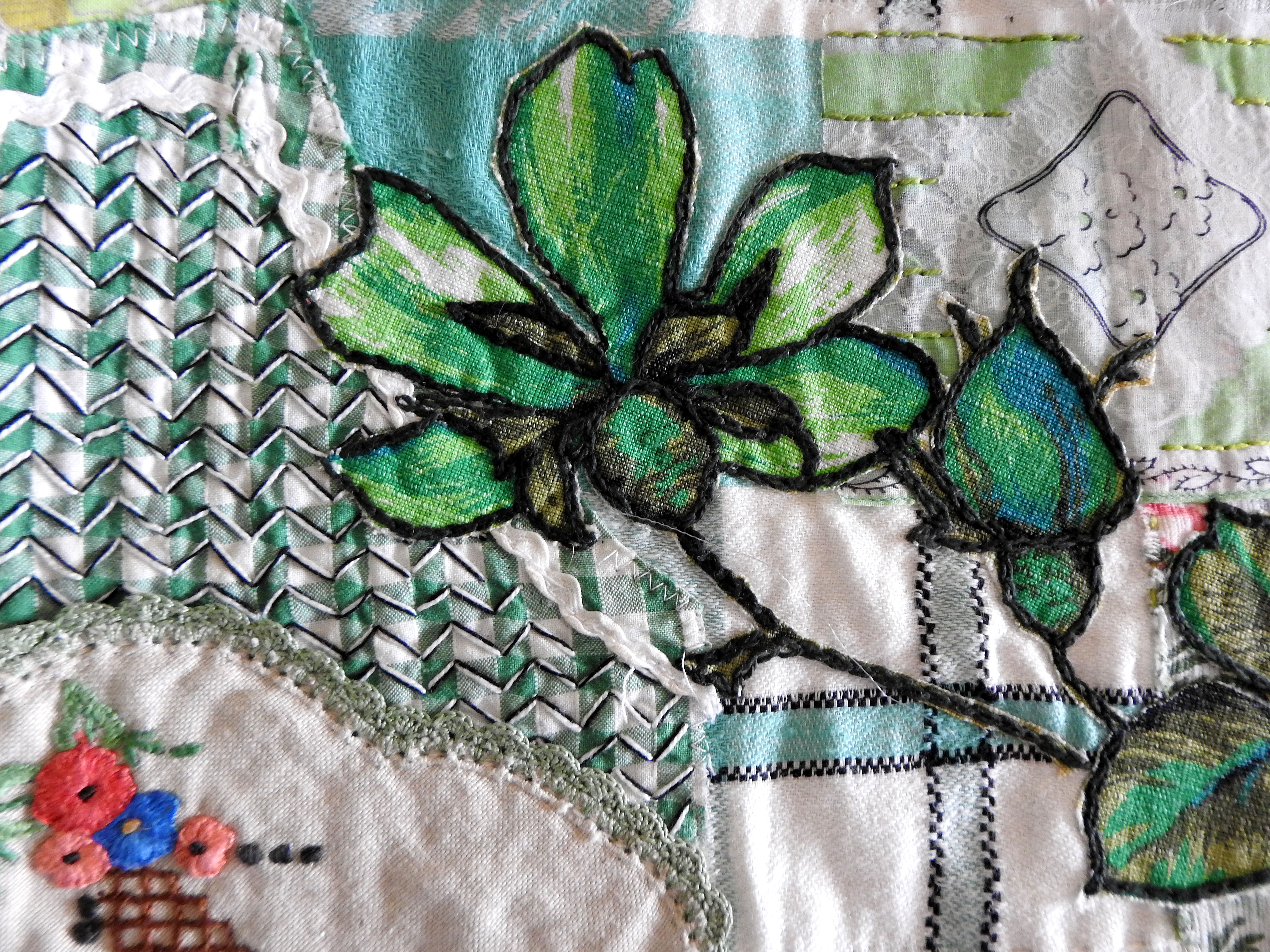
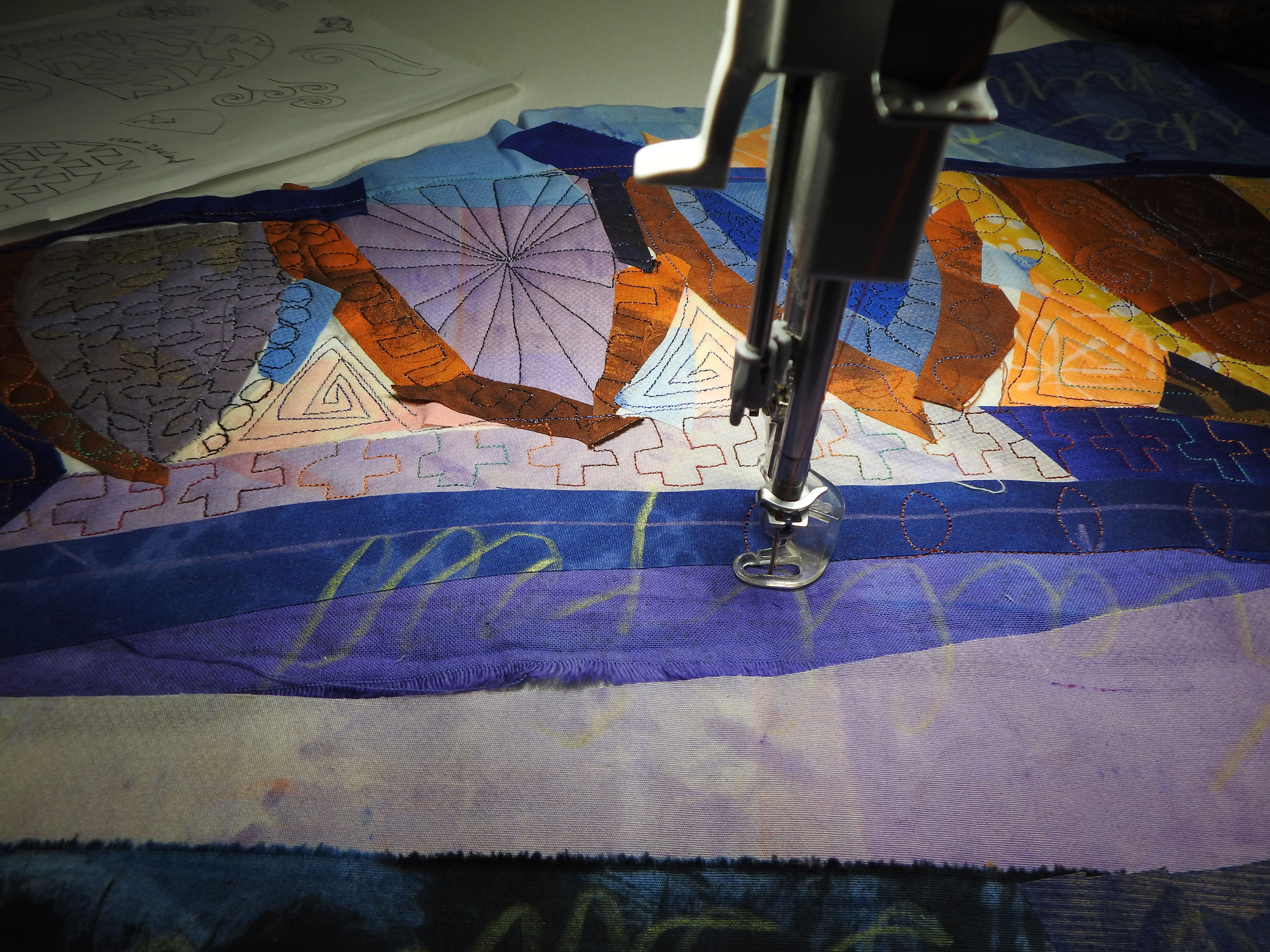
It is a further challenge to add stitching that will complement these marks. After a lot of thought I decided to use have a combination of hand and machine stitching (see details).
This piece was recently exhibited in the ‘One Step Further’ 2021 exhibition at Kyabram Art Gallery.